Branding & Graphics
Branding and graphics projects I worked on, with clients worldwide, to bring transformation through image, messaging, adaptation and cultural context
Brand Design
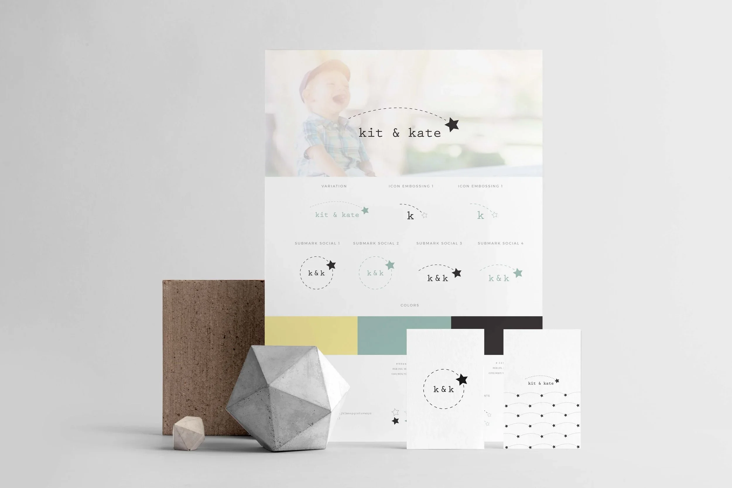
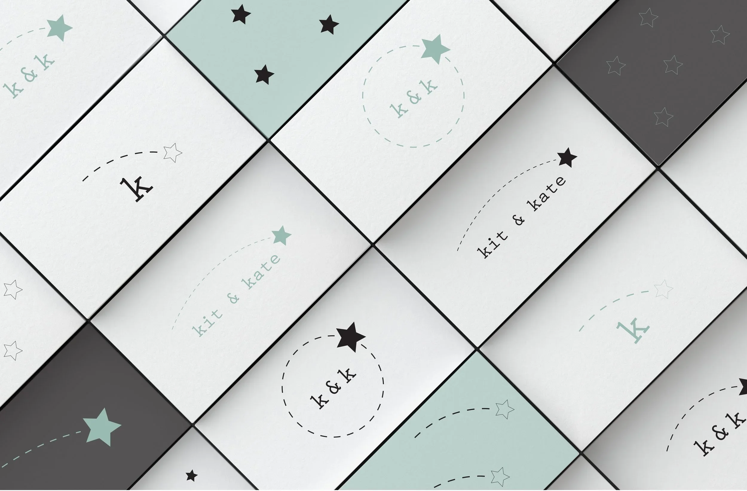
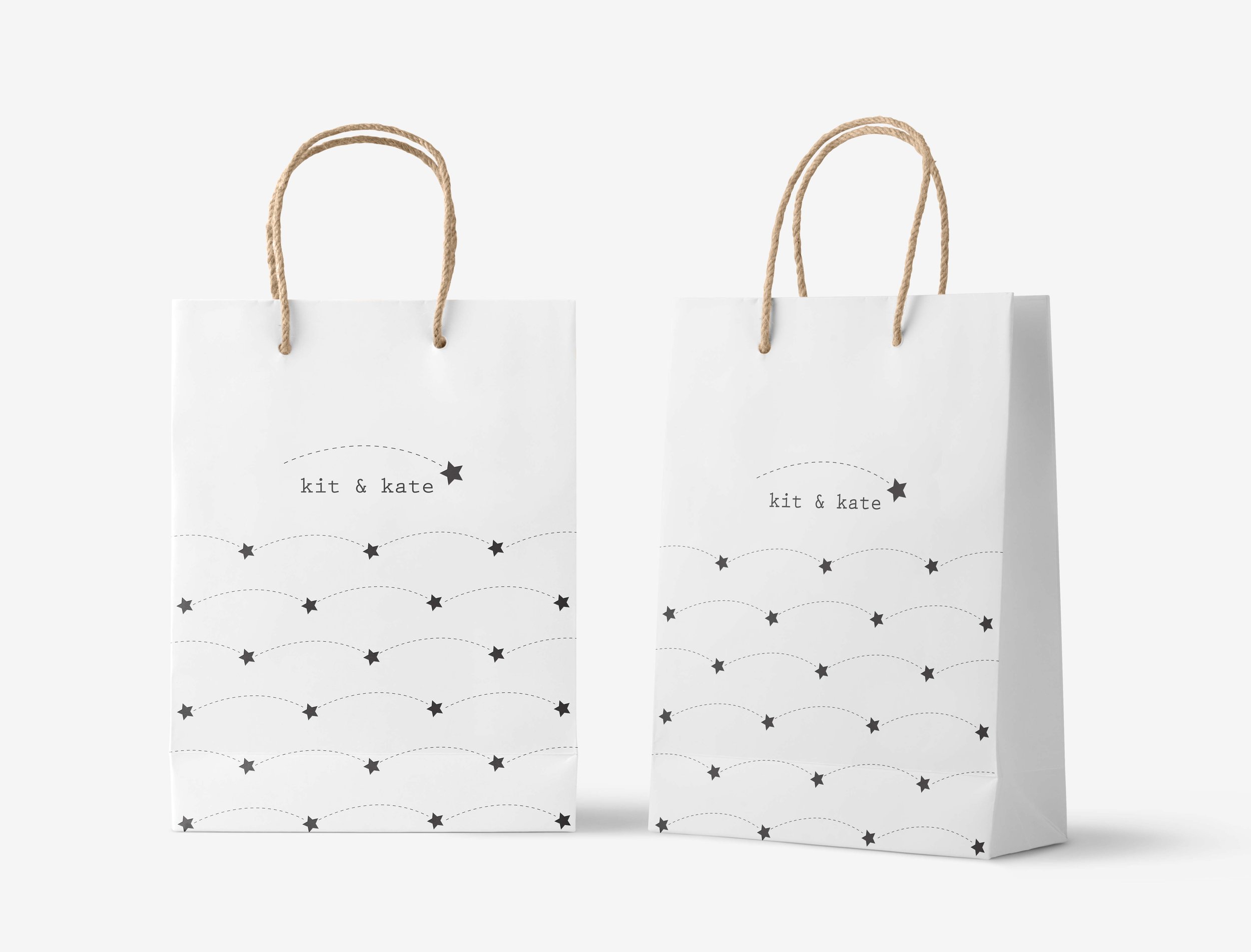
Reframing a Brand Identity Through Whimsical Minimalism - Kit & Kate
Children’s lifestyle and premium handmade goods, with an aesthetic shifting toward “controlled whimsy”, a visual language that balances playfulness, and craftsmanship with minimalist design sensibilities.
Within this context, my role focused on translating the brand’s existing identity and aspirations into a coherent visual and conceptual system aligned with its growth phase.
This process included:
Conducting a discovery questionnaire to clarify brand values, narrative direction, and customer perception
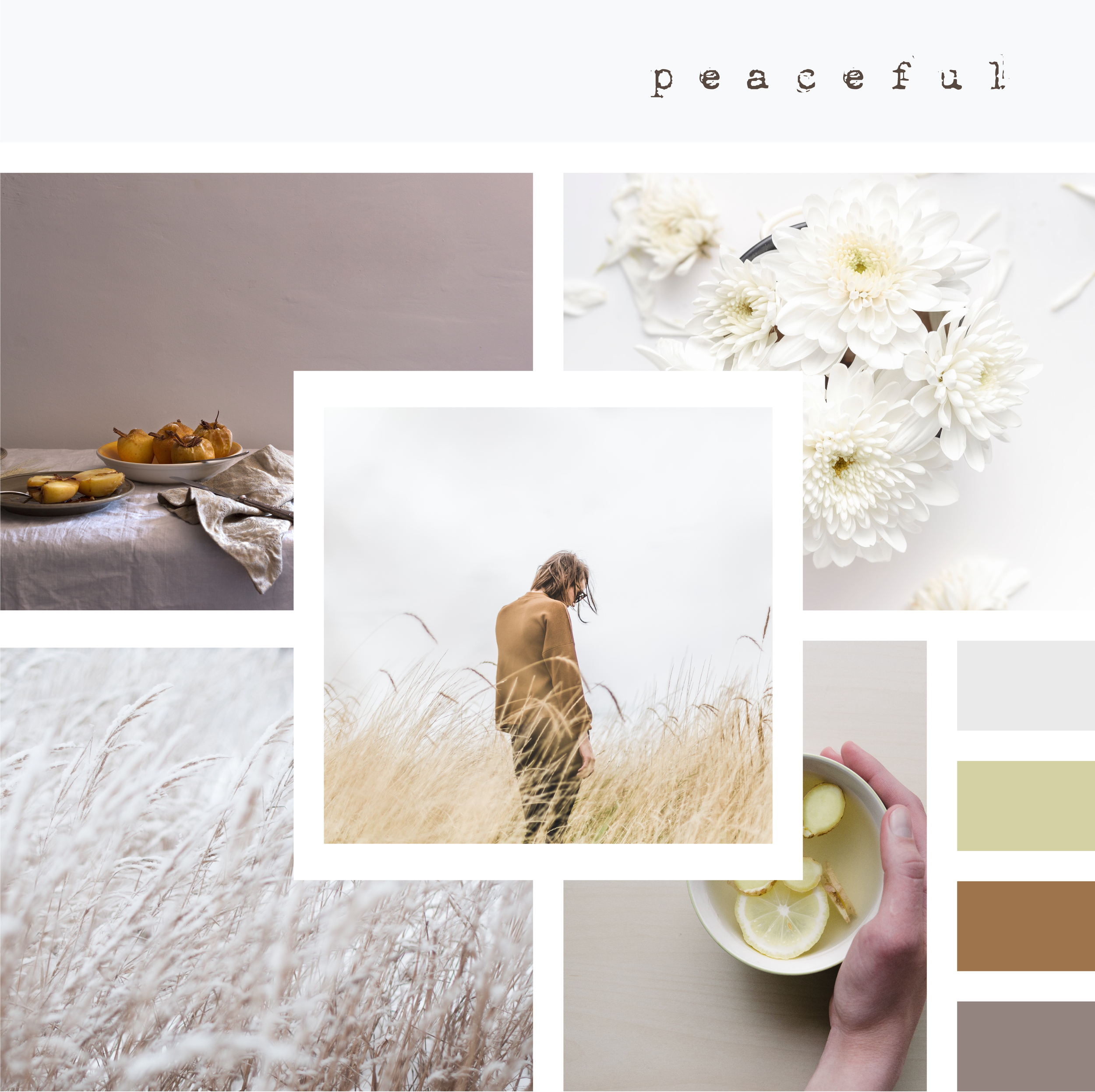
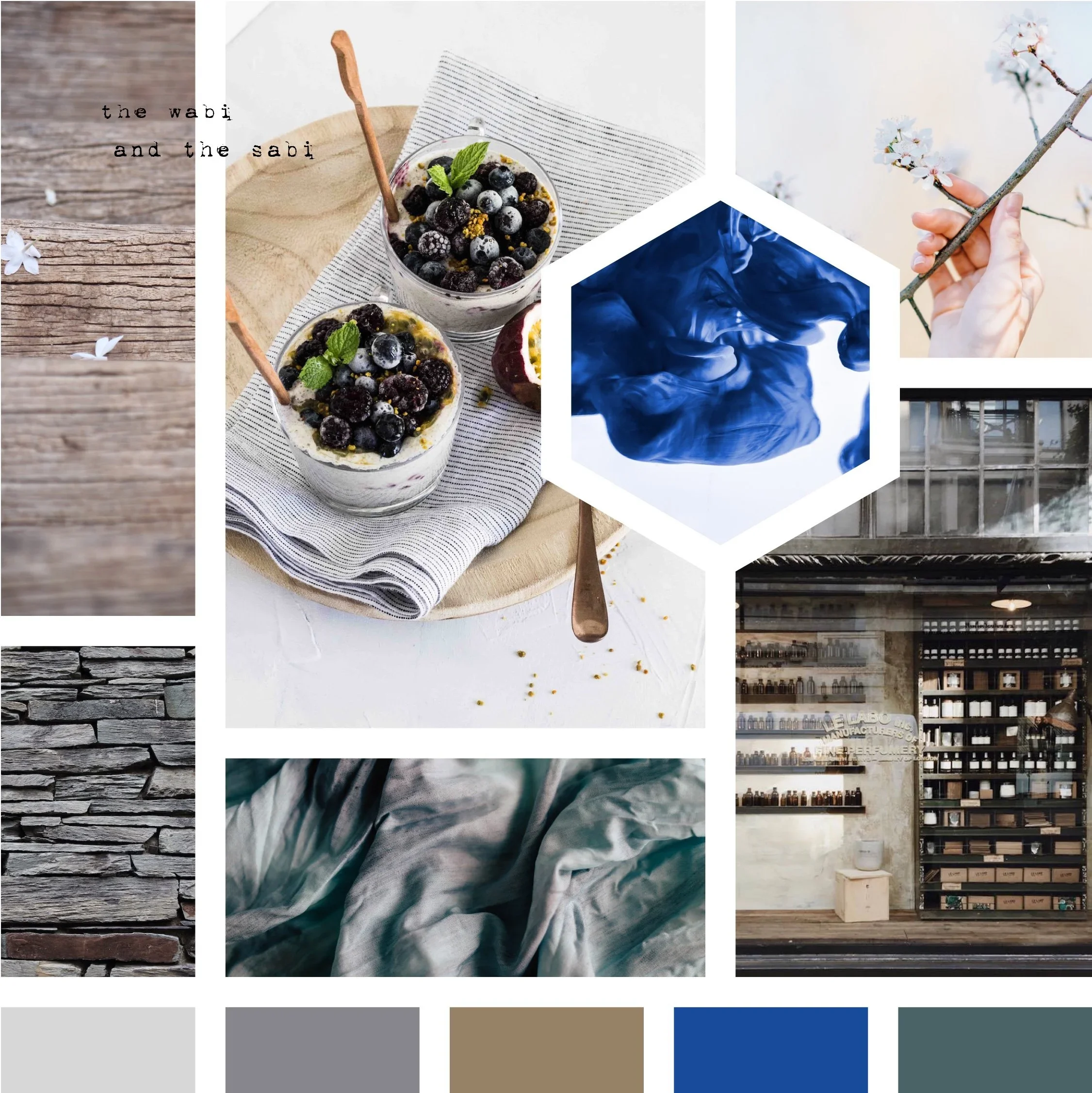
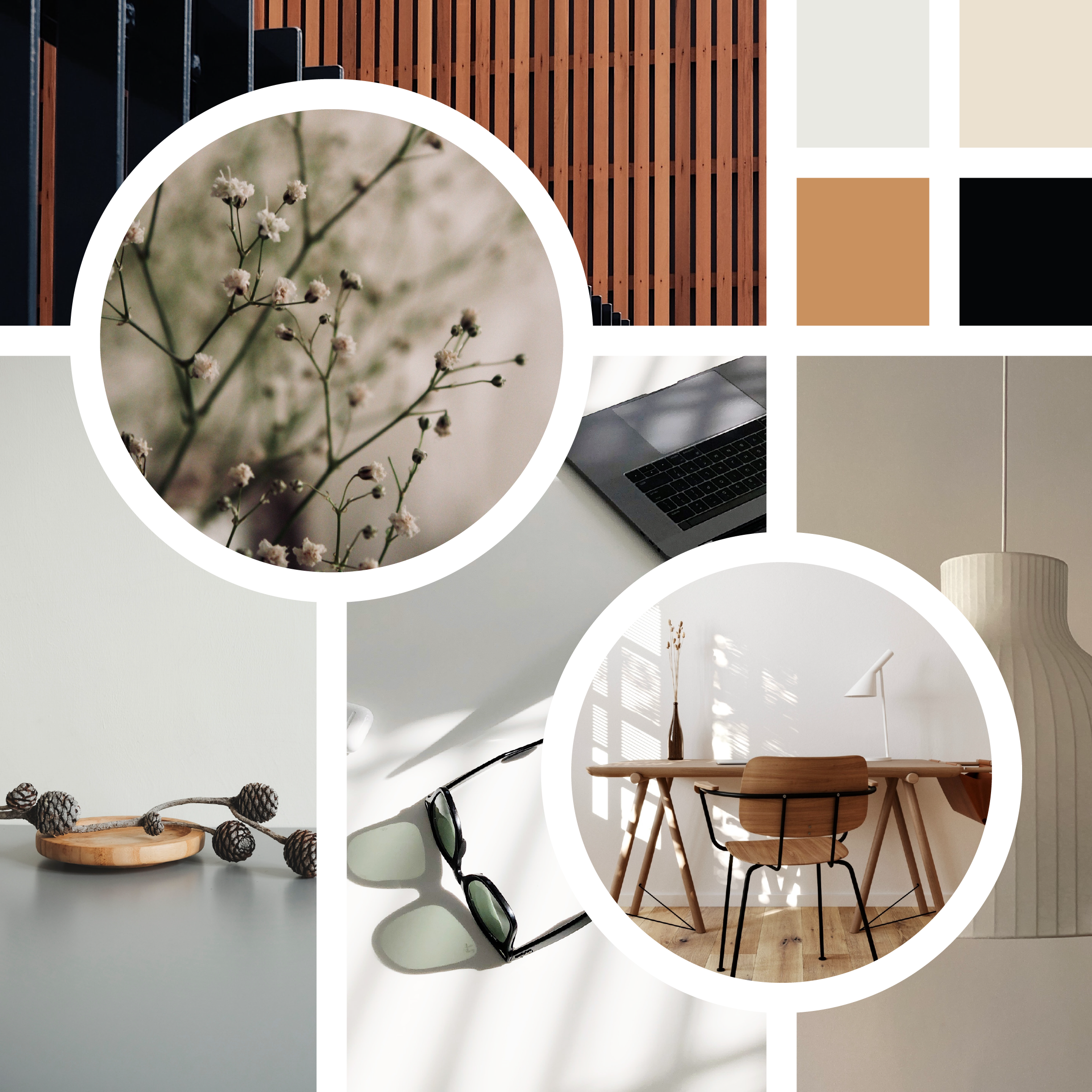
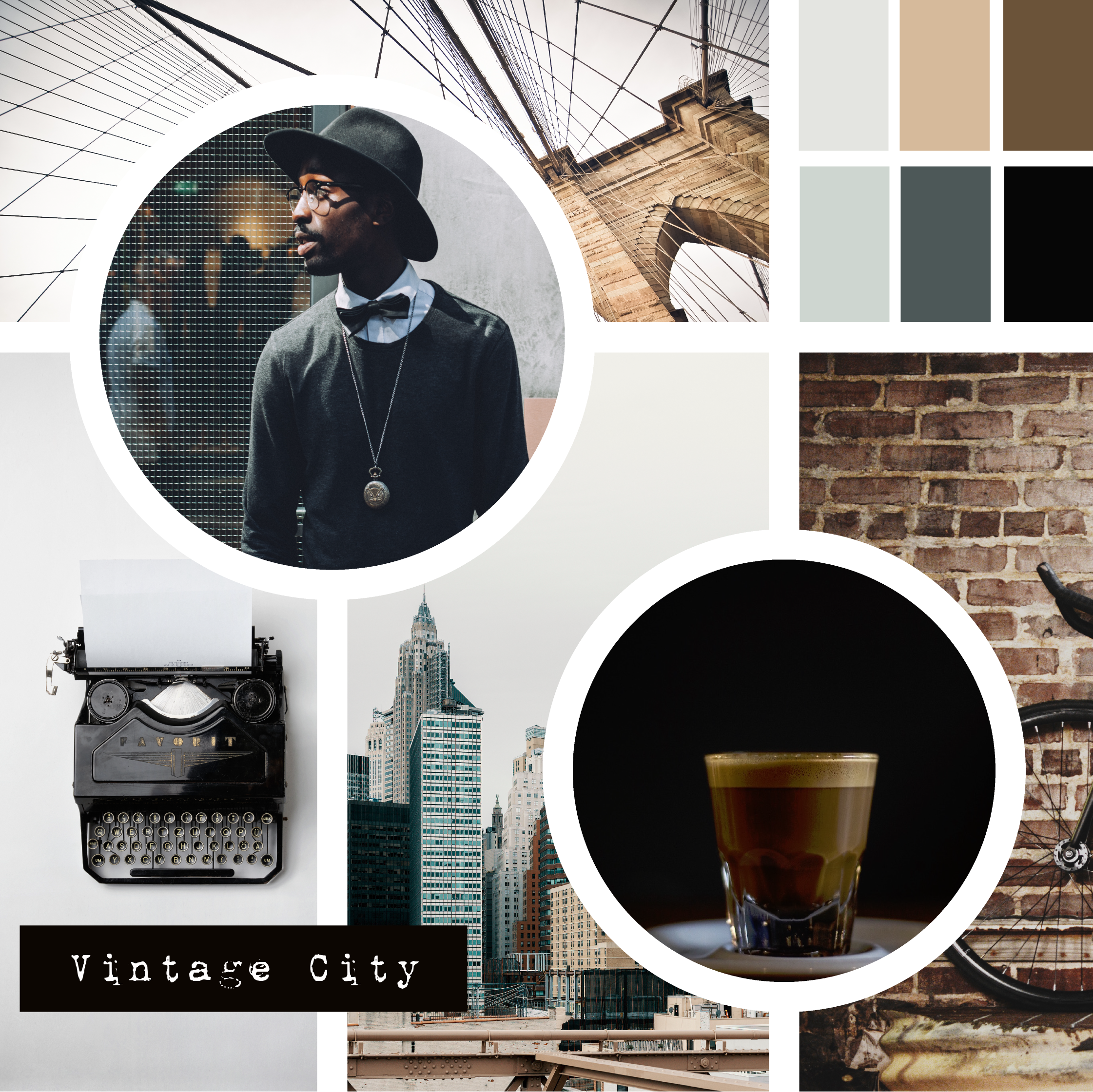
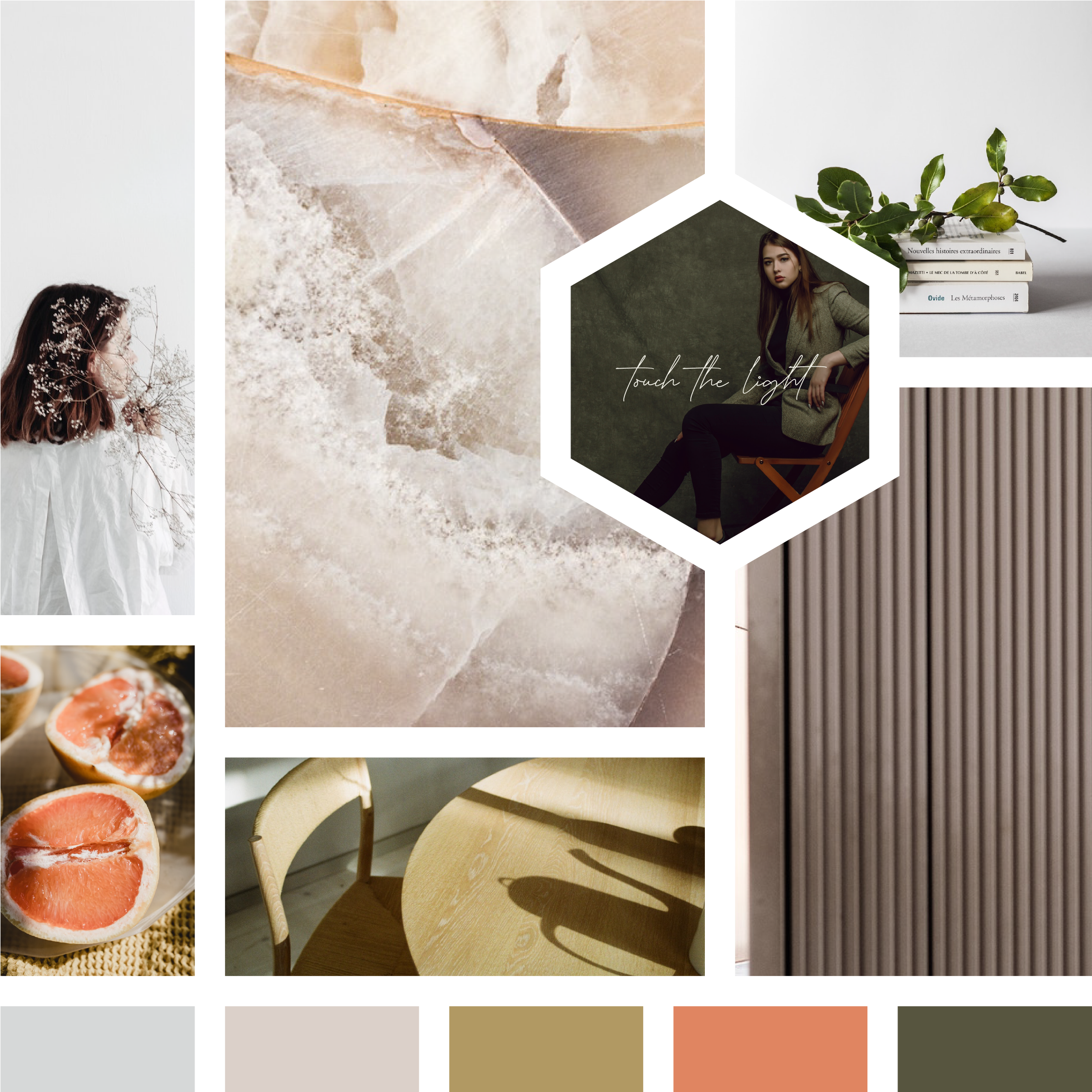
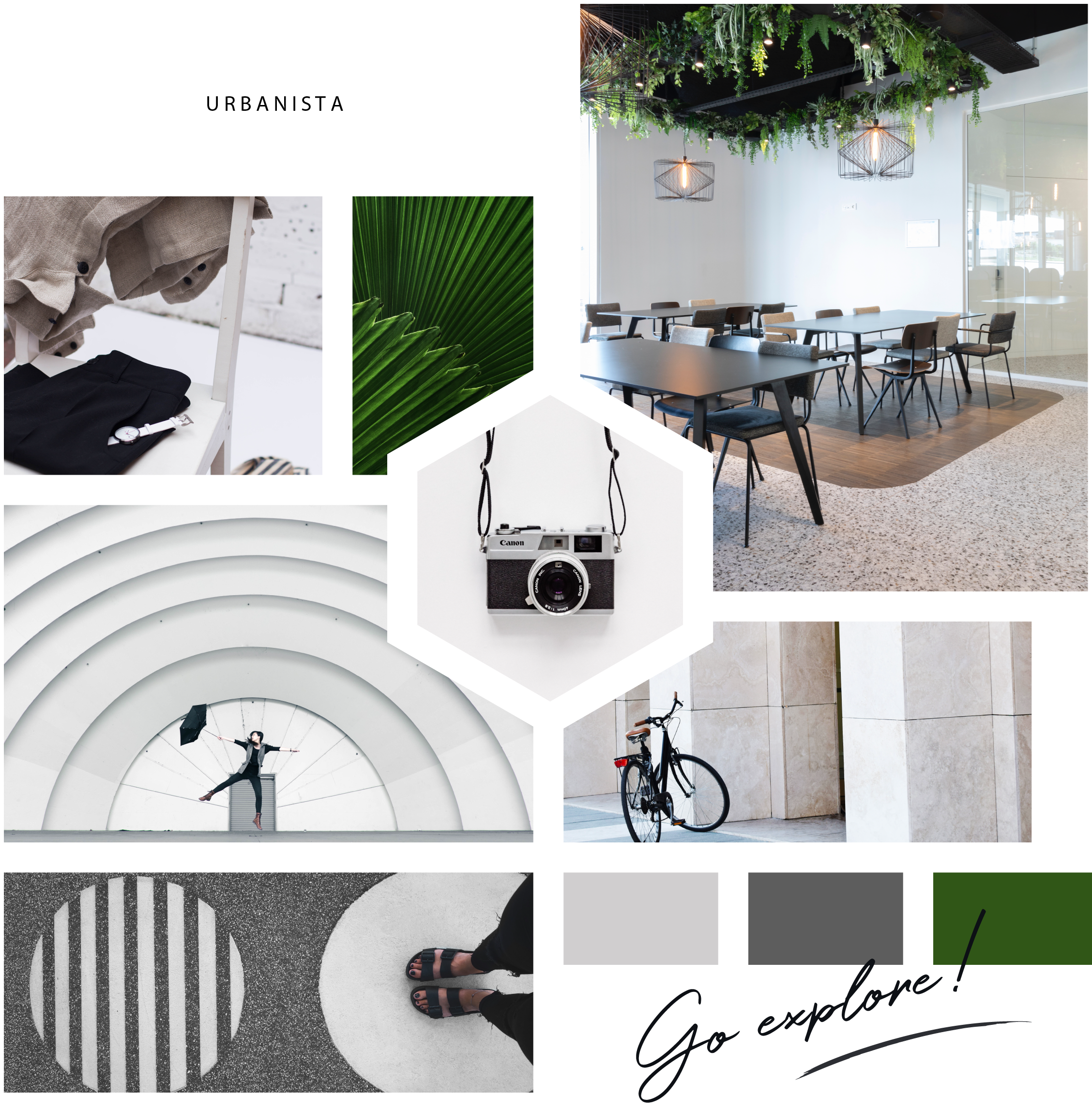
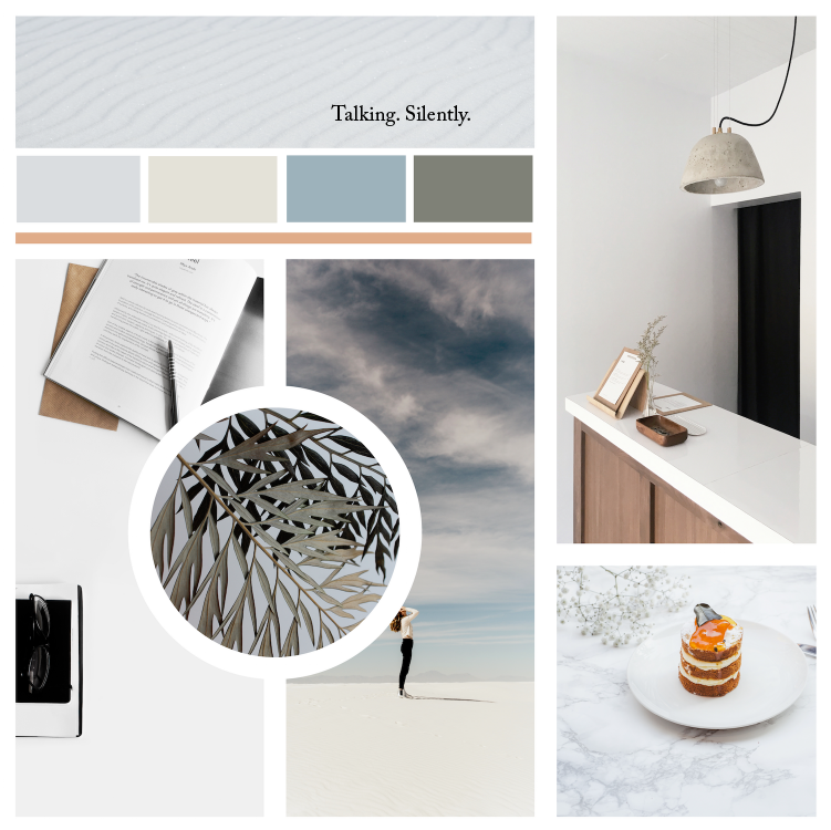
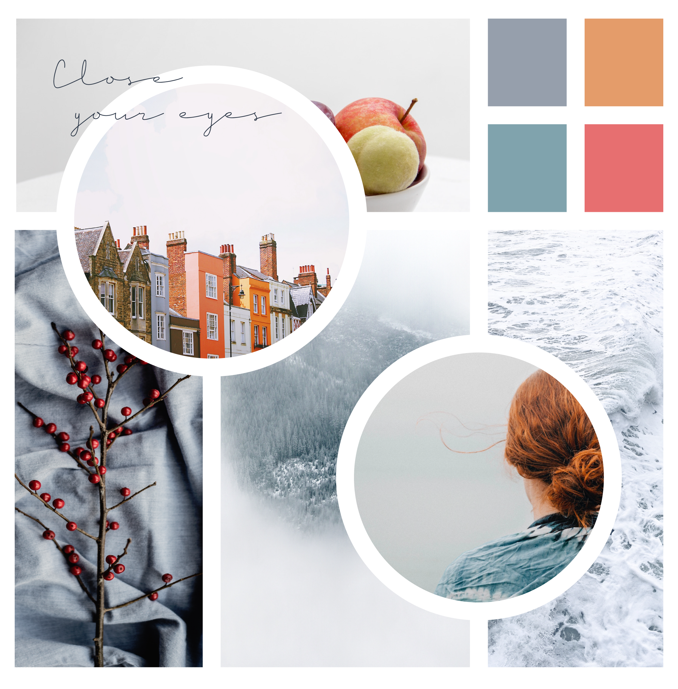
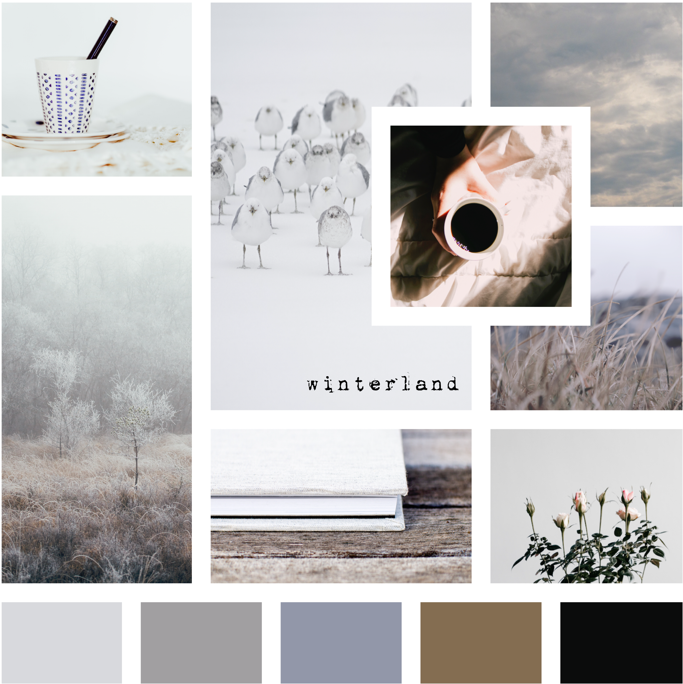
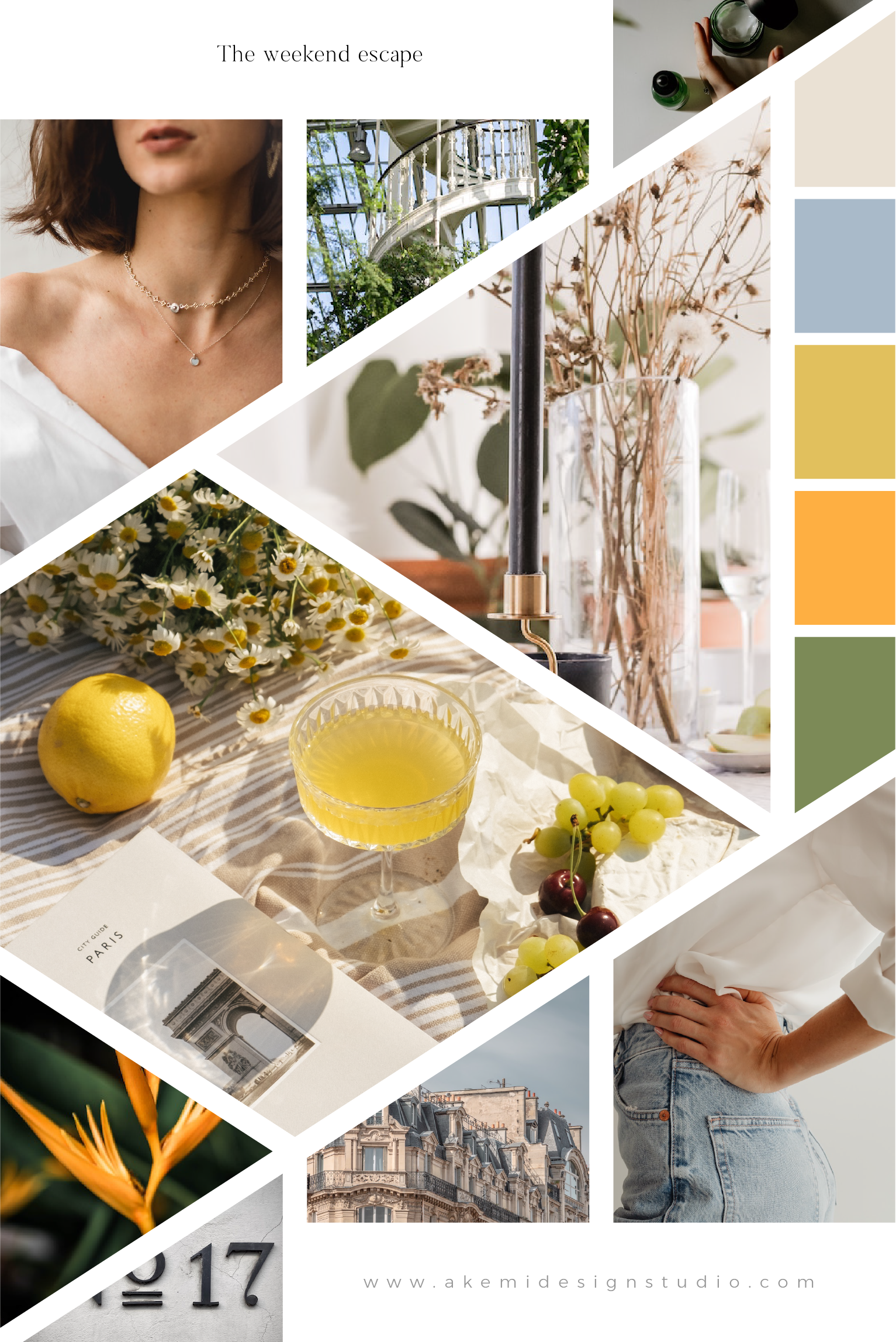
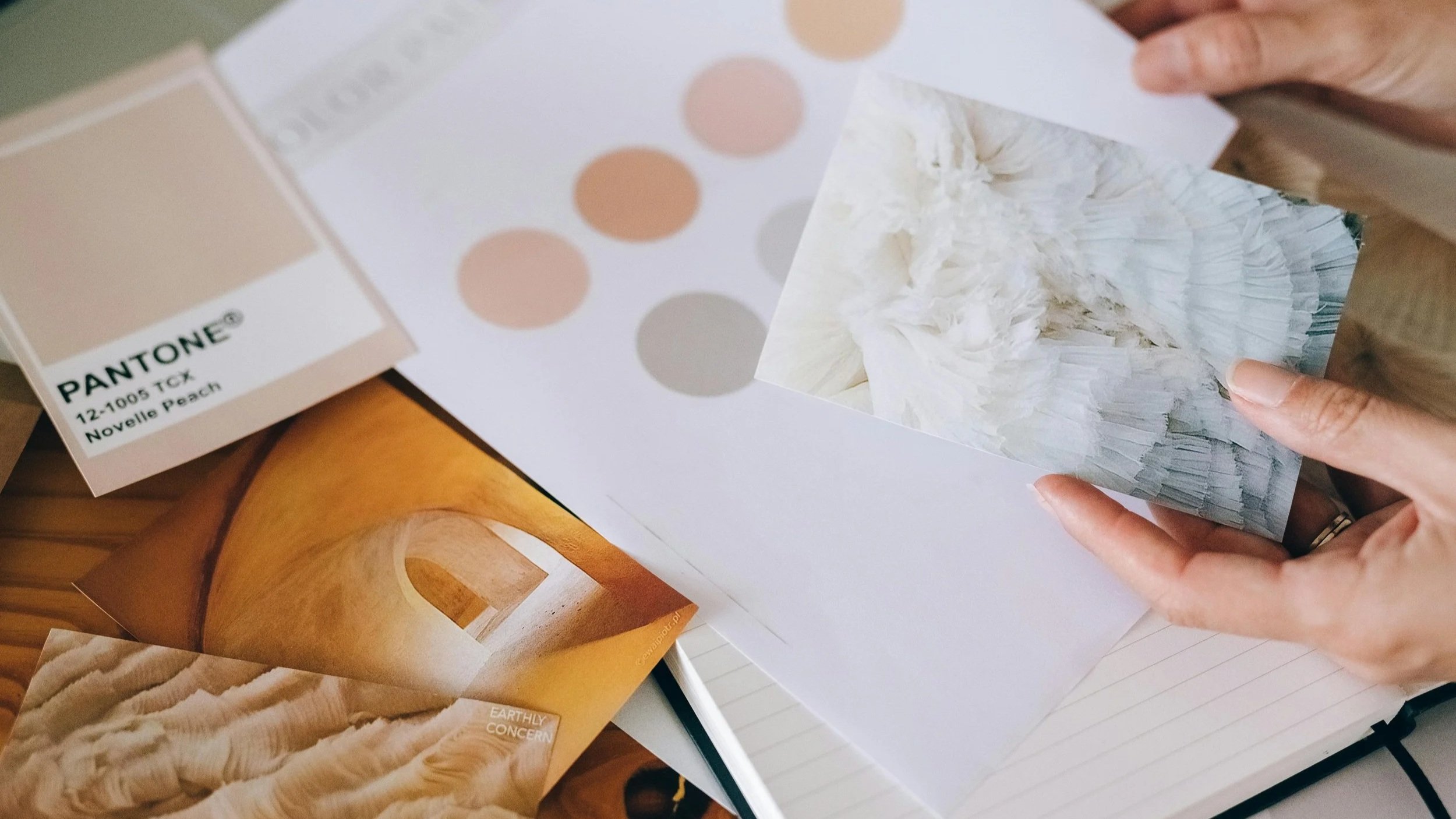
Developing a mood board to establish a coherent visual and cultural direction for the rebrand
Translating strategic insights into a structured brand identity system
The resulting work included:
full brand identity guidelines
packaging design system
business card design
Translating Nordic Minimalism for the Italian market - Welchome Store
Contemporary home décor branding is increasingly shaped by the global circulation of minimalist aesthetics, particularly Nordic design languages. However, these aesthetics are not culturally neutral, and they can be reinterpreted through local taste and emotional expectations of “home” and domesticity.
In the Italian context, minimalism is often received not as pure reduction, but as something that can benefit from warmth, ornament, and expressive detail.
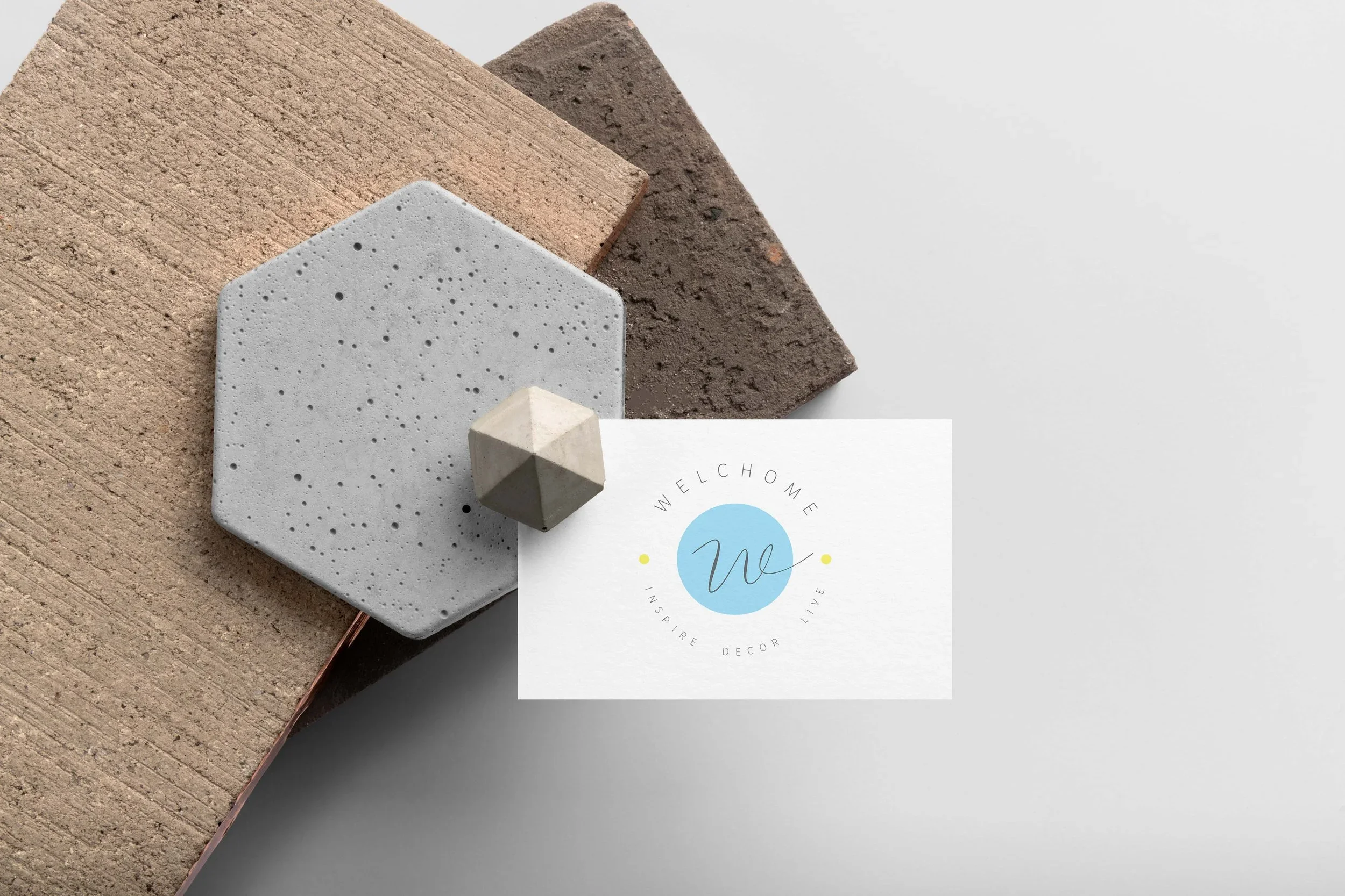
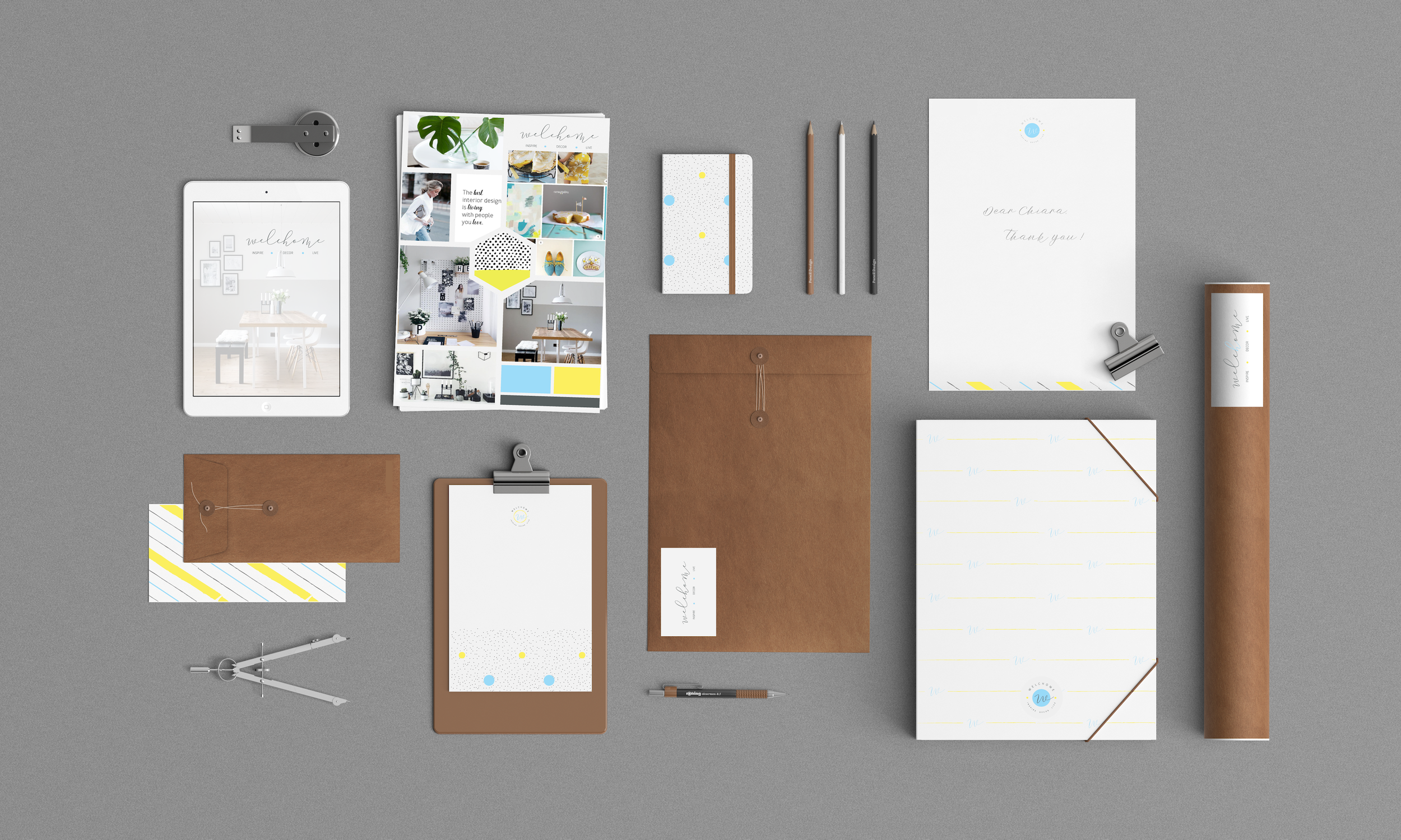
Within this context, my role focused on developing a visual identity for Welchome Store, an Italian interior decor online shop, that could mediate between global minimalist aesthetics and local Italian visual sensibilities.
The process included:
Conducting a brand discovery questionnaire to define values, audience expectations, and aesthetic direction
Developing a mood board to establish a coherent visual language balancing minimalism and expressive detail
Translating these insights into a structured brand identity system that could operate across physical and visual touch-points
Key design decisions included introducing:
a calligraphic icon to reference classical and expressive visual traditions
subtle colour accents to soften the strictness of minimalist composition
a refined balance between white space, structure, and ornamental detail
The resulting identity system included:
full brand identity guidelines
packaging pattern system
business card design
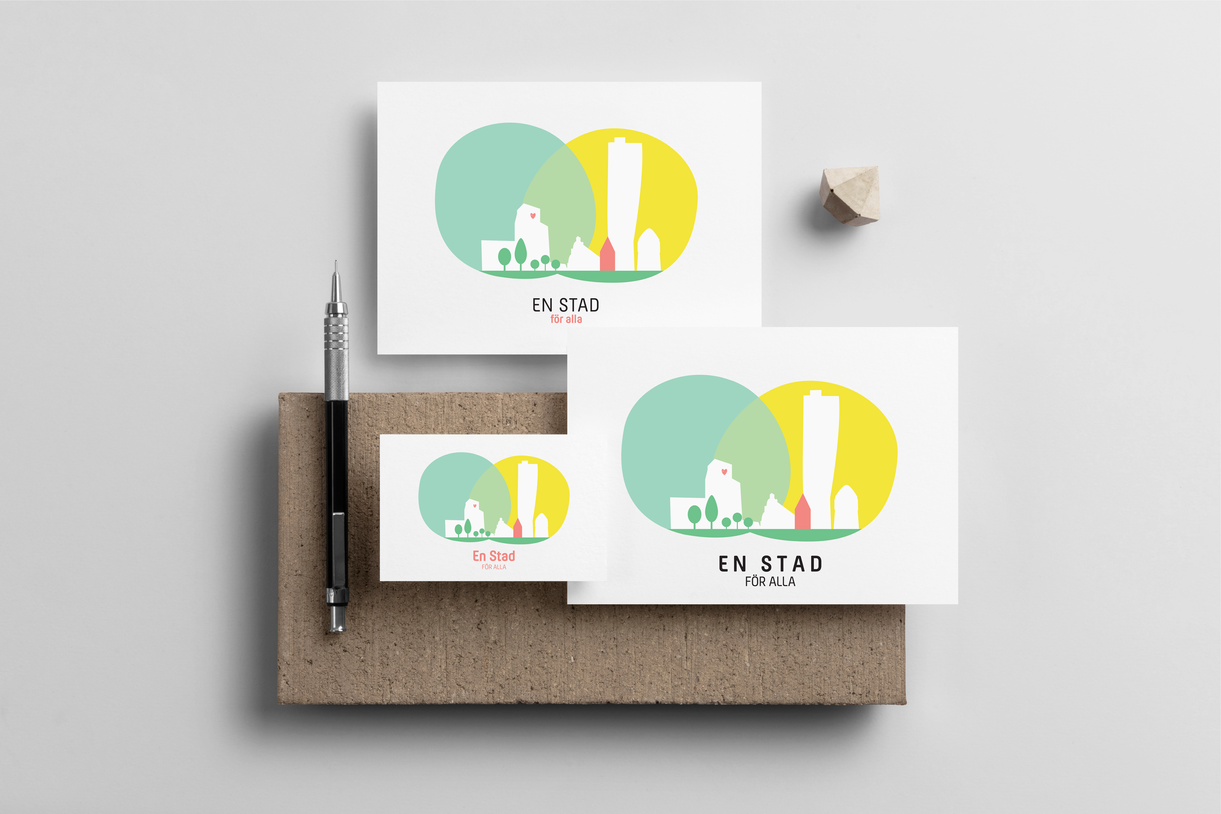
Visual Identity for Social Impact - Ett Hem Att Trivas i + Ett Stad För Alla
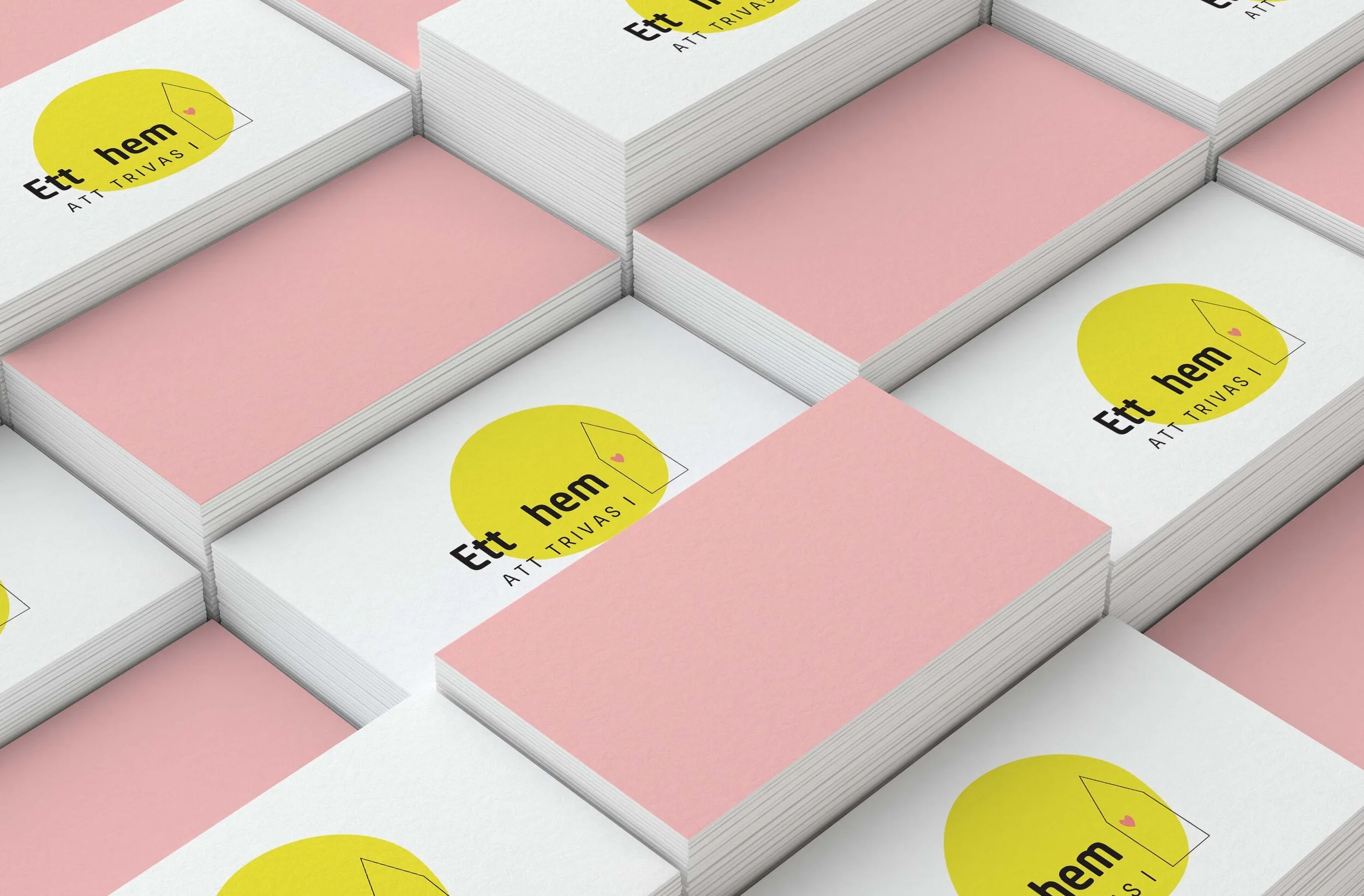
Across Northern European design culture, there is a historical intersection between design and well-being.
Within this framework, design operates not only as aesthetic pleasure, but as agent of social impact, using visual identity to communicate values of care, accessibility, and collective well-being. In particular, child-friendly design is a lens through which broader questions of liveability, inclusion, and urban wellbeing can be reimagined, extending from domestic spaces into public infrastructure.
This project sits at the intersection of branding and social design, with the aim to translate a social mission into a visual language that is:
approachable and emotionally resonant (child-friendly, warm, inclusive)
while remaining structured, minimal, and professionally coherent
At a deeper level, the project reflects a broader cultural shift: the expansion of “care-oriented design” from private domestic environments into collective urban and civic spaces.
Branding here becomes a vehicle for expressing not only organisational identity, but also social intention.
The process included:
Conducting a discovery questionnaire to clarify organisational values, audience, and aesthetic direction
Developing a mood board to define a coherent visual language balancing playfulness with clarity and minimalism
Translating strategic and emotional inputs into a structured brand identity system
The resulting system included:
full brand identity guidelines
business card design
presentation PDF design
custom-designed vehicle decals for field operations
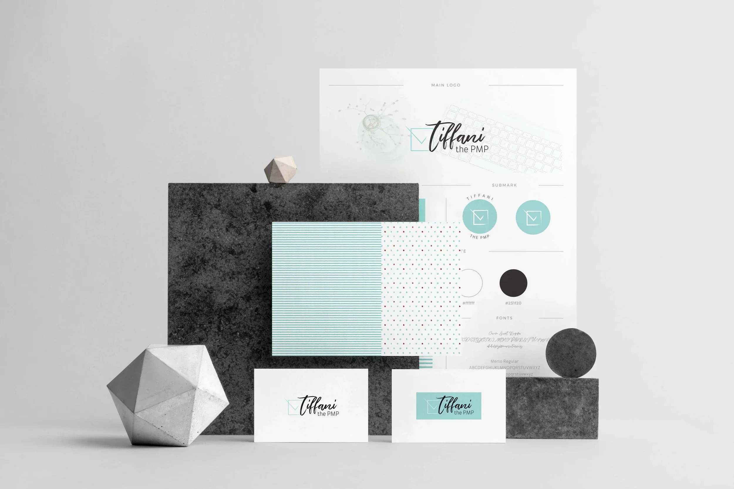
Other client brand design projects

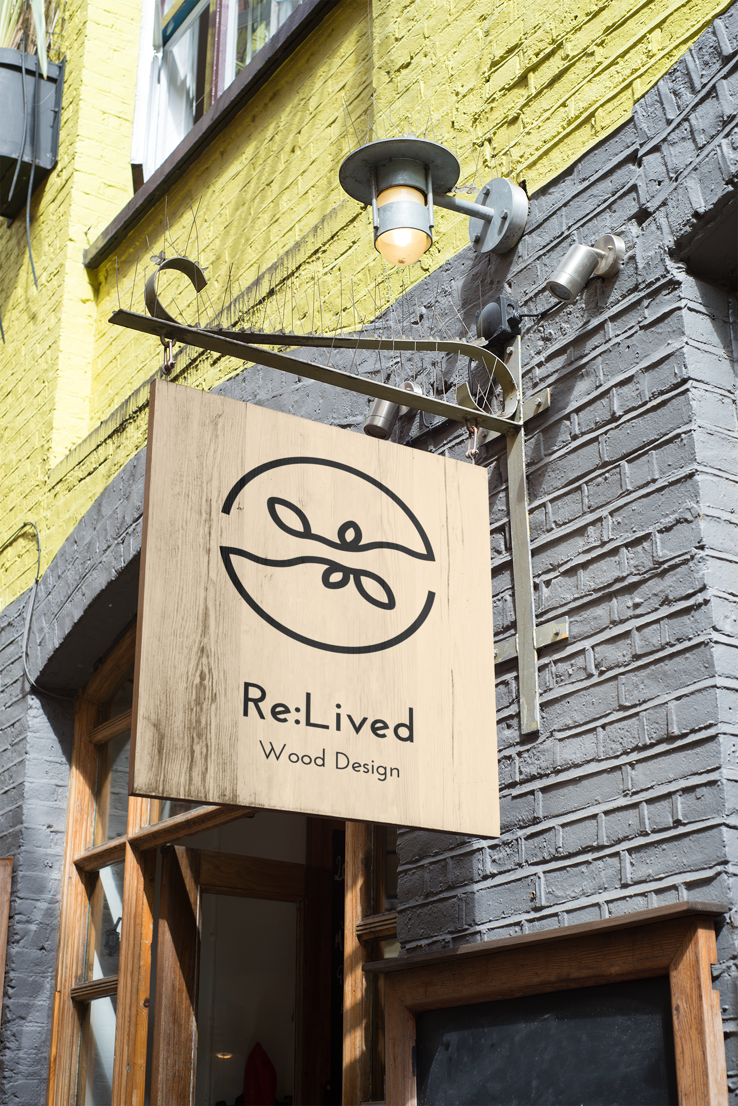
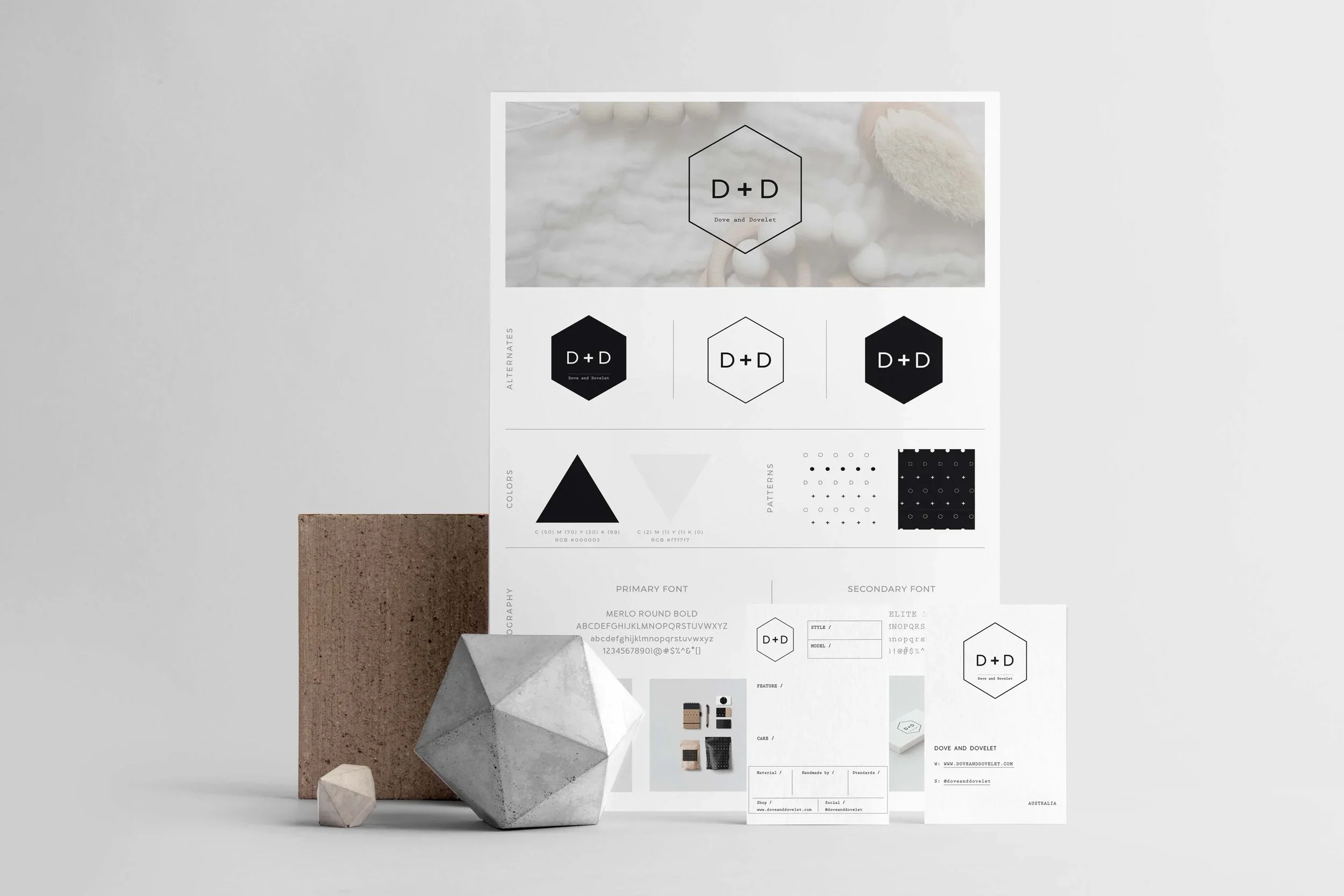
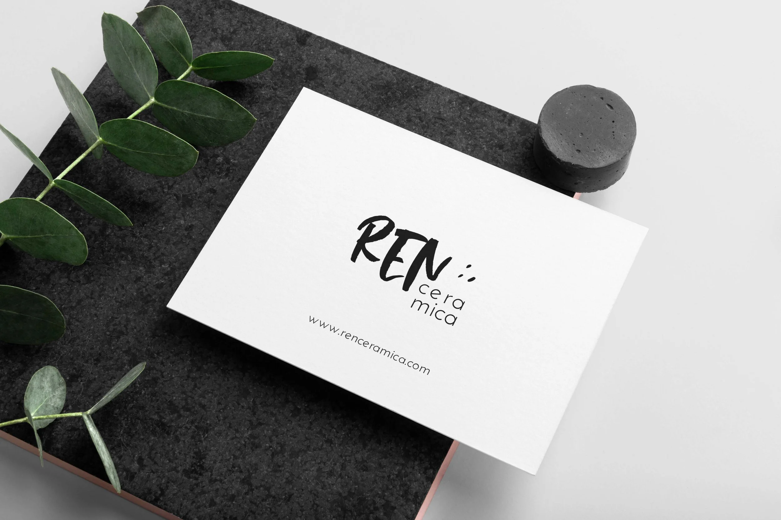
App Graphics and UI
Gentle Learning Environment Through Digital Play
As digital products increasingly mediate children's learning experiences, concerns have grown around overstimulation, excessive screen engagement, and the cognitive effects of attention-driven design patterns.
At the same time, parents and educators are seeking digital environments that support learning while respecting children's emotional wellbeing, attention spans, and developmental needs.
Many educational apps rely on bright visual stimuli and rapid interactions to maintain engagement. While effective at capturing attention, these approaches can sometimes compete with the learning process itself.
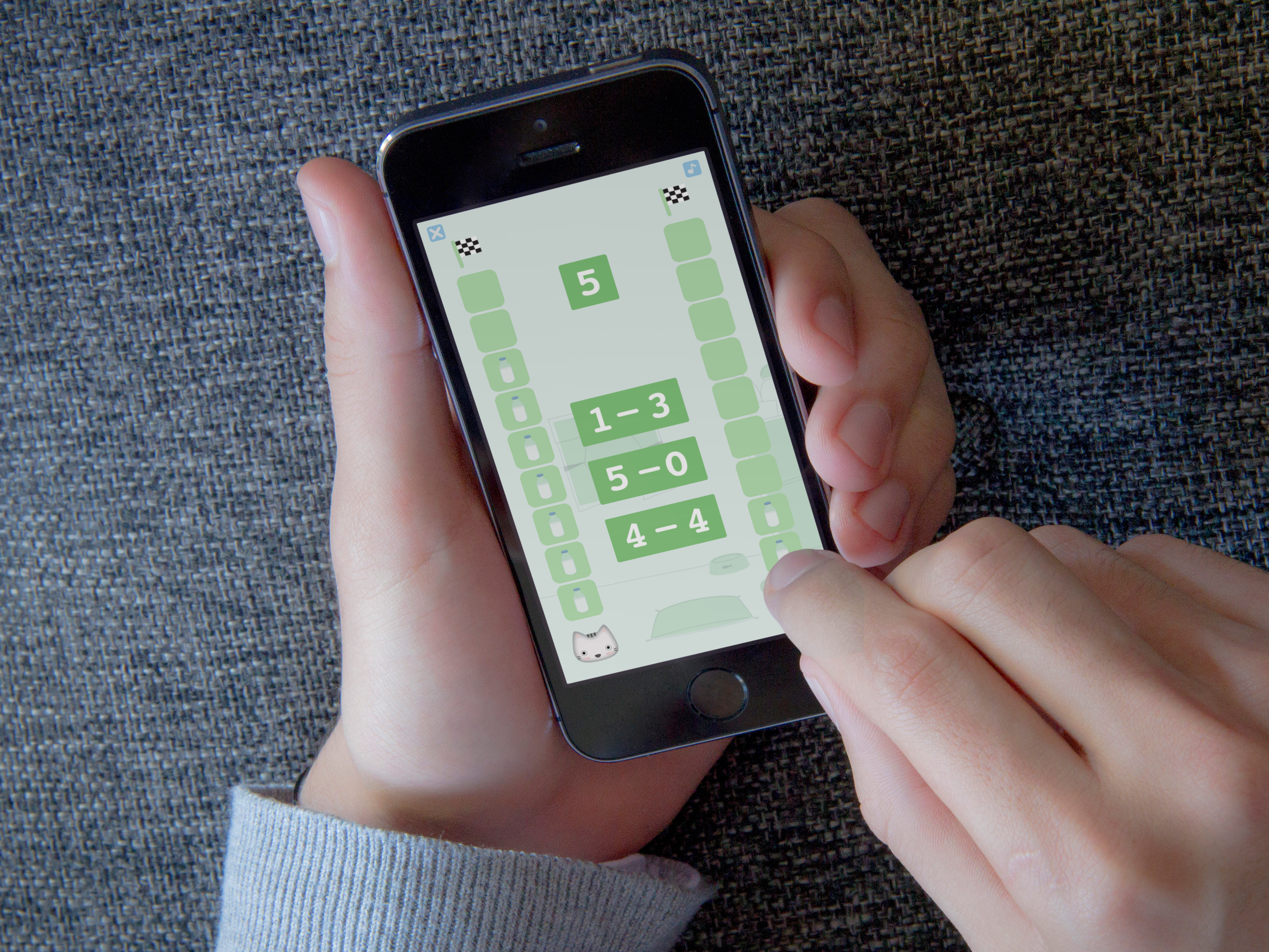
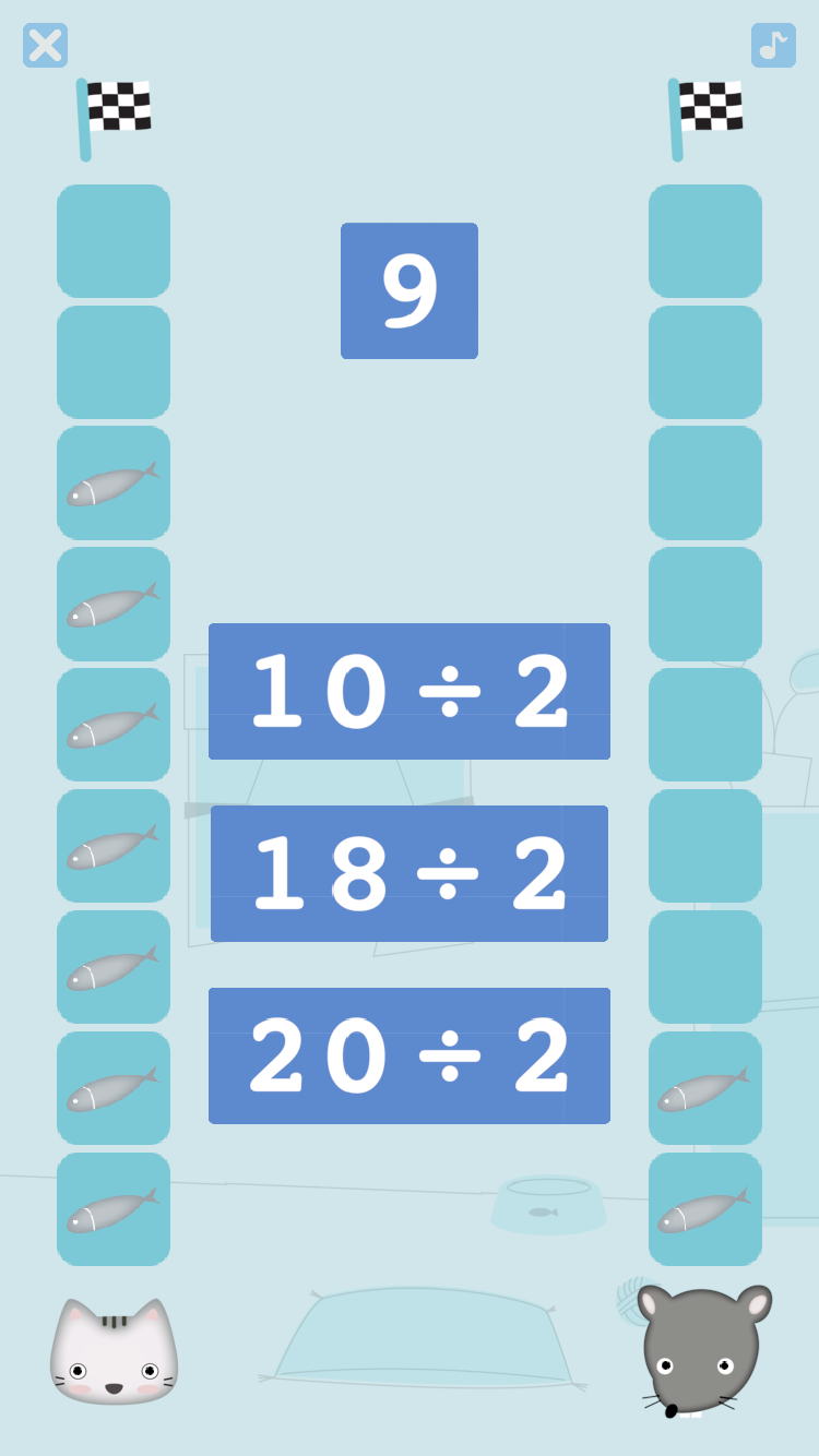
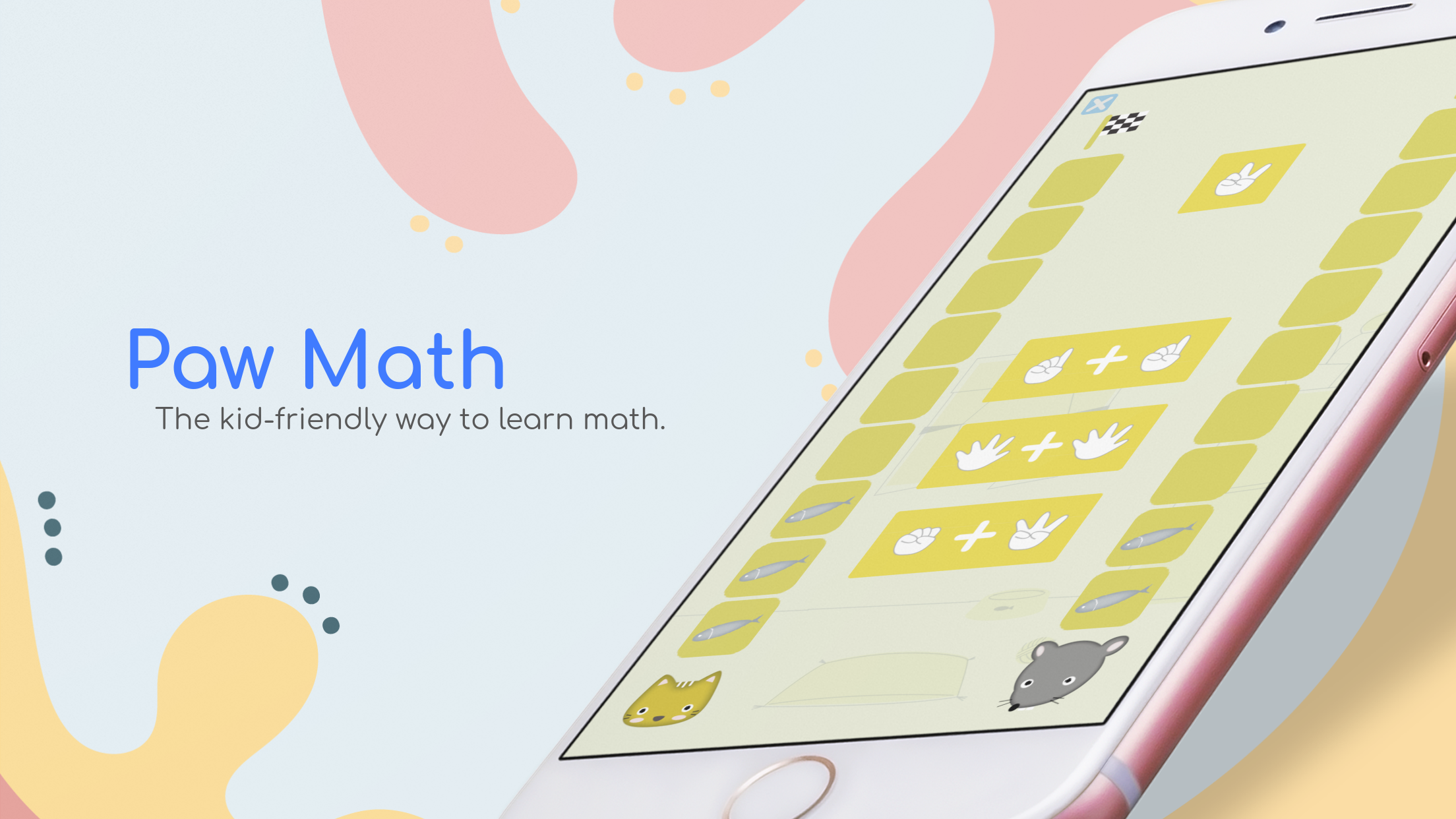
This project, which resulted in an app called Paw Math, explored an alternative perspective: that engagement can emerge from emotional comfort and slow, visual stimuli.
My contribution focused on translating this insight into a coherent visual and interaction system.
This included:
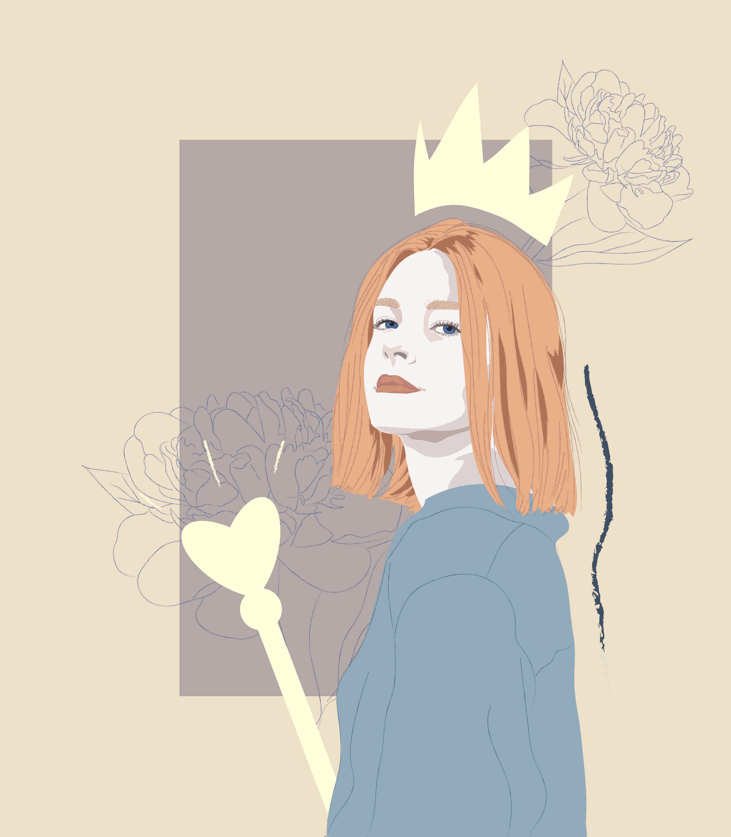
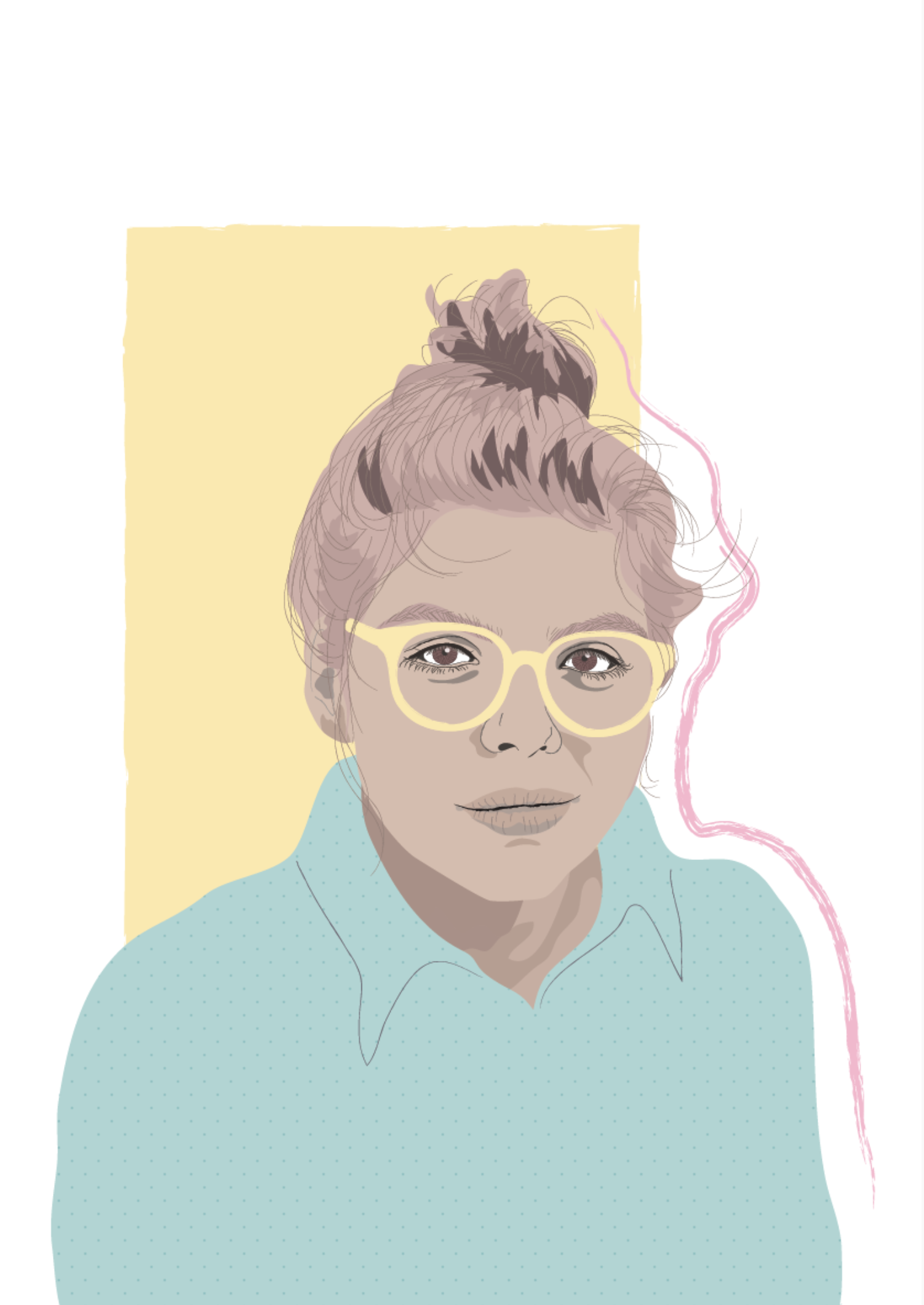
Developing the app's visual identity, illustration style, and graphic assets
Creating a visual language based on soft colours, approachable characters, and simple forms
Designing user interface elements that prioritised clarity, accessibility, and ease of navigation for young learners
Visuals
Some of the mood boards and illustrations created over the years