Cultural Translations
Projects where cultural signals are translated into brand identity systems, narratives, and visual communication
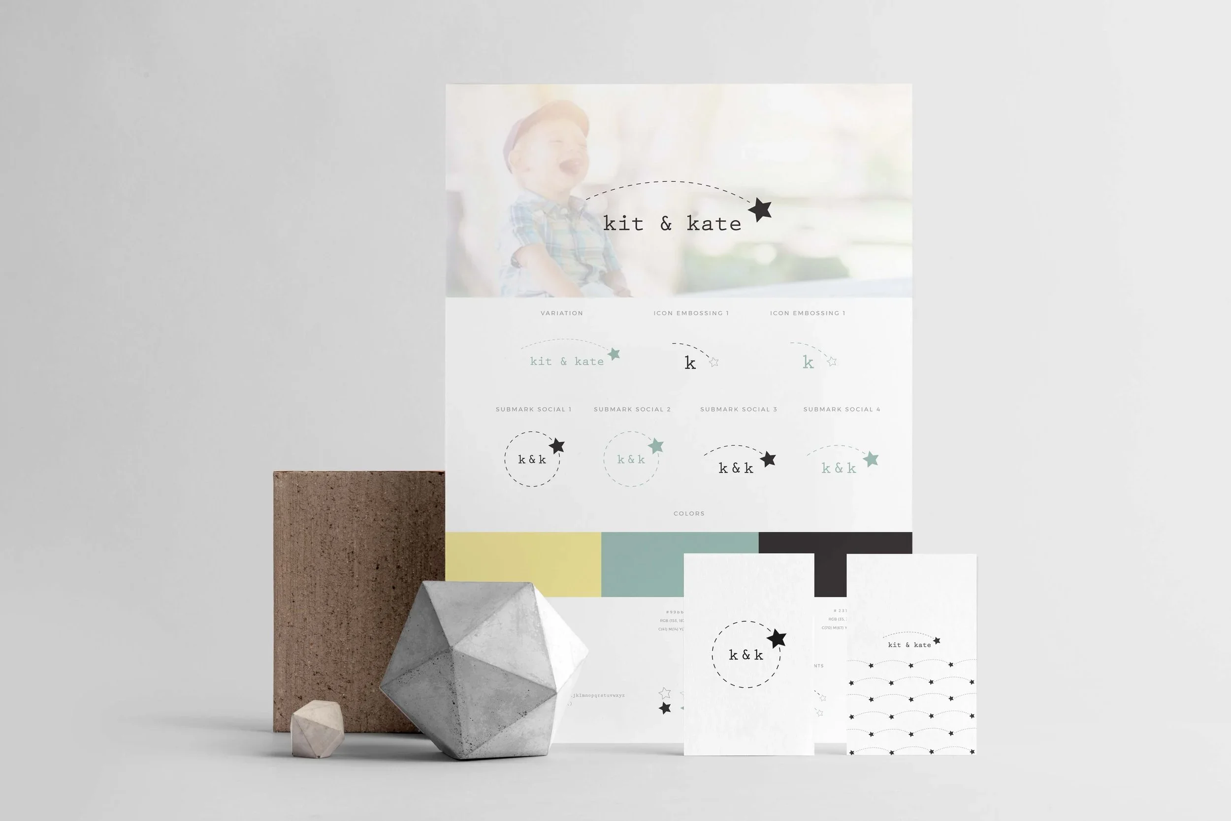
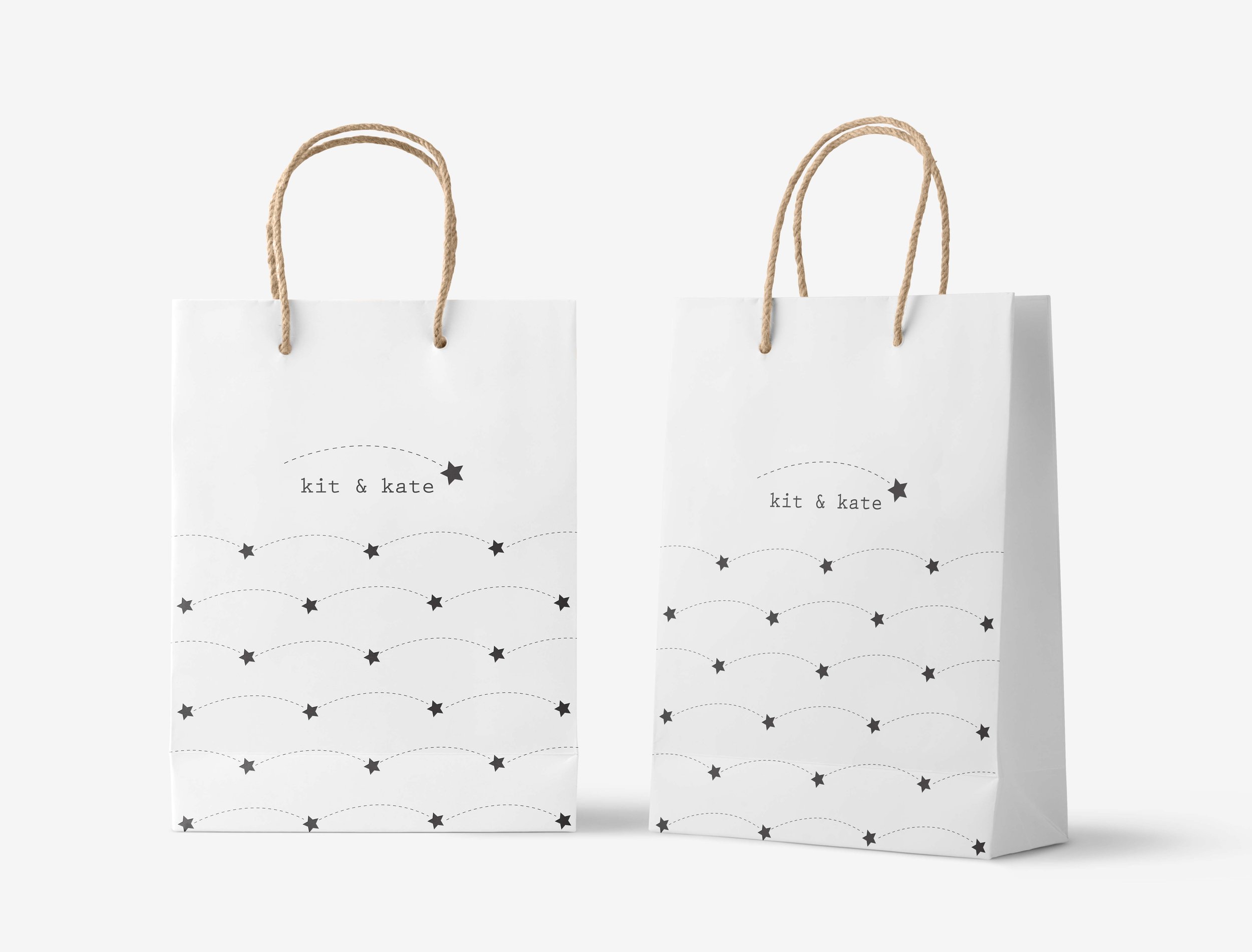
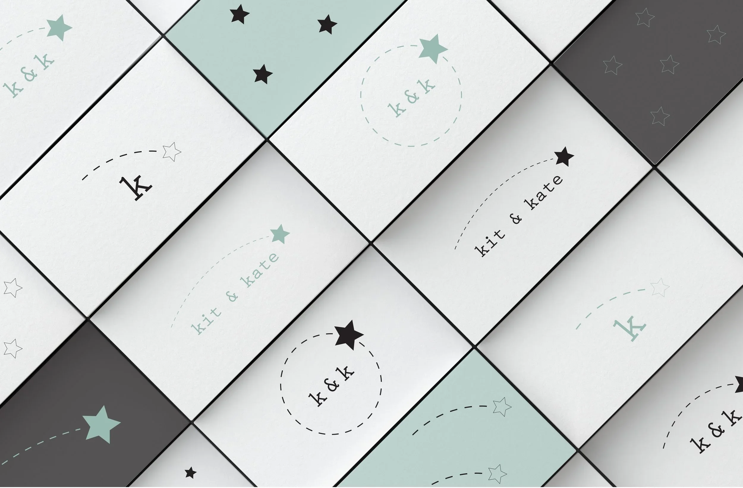
Reframing a Brand Identity Through Whimsical Minimalism - Kit & Kate
Cultural Signal
In the children’s lifestyle and premium handmade goods market, there is a growing aesthetic shift toward “controlled whimsy”—a visual language that balances emotional warmth, playfulness, and craftsmanship with minimalist design sensibilities.
This reflects a broader cultural movement in design consumption: parents increasingly seek products that communicate care and imagination, while still aligning with contemporary preferences for clarity, restraint, and aesthetic coherence.
Within this context, branding becomes a negotiation between emotional expressiveness and design-led minimalism.
Interpretation
Brand identity in this category is not only a visual system, but a cultural signal of parenting values, taste, and lifestyle aspiration.
The central challenge is to translate emotional and playful associations (childhood, imagination, softness) into a coherent visual system that still resonates with design-conscious consumers who favour minimalism, refinement, and aesthetic discipline.
This creates a tension between:
expressive emotional storytelling
and controlled visual reduction
Successful branding in this space depends on resolving this tension without losing either dimension.
Translation (Intervention Lens)
Within this context, my role focused on translating the brand’s existing identity and aspirations into a coherent visual and conceptual system aligned with its growth phase.
This process included:
Conducting a discovery questionnaire to clarify brand values, narrative direction, and customer perception
Developing a mood board to establish a coherent visual and cultural direction for the rebrand
Translating strategic insights into a structured brand identity system
The resulting work included:
full brand identity guidelines
packaging design system
business card design
The process aimed to preserve the emotional and whimsical core of the brand while refining its expression into a more minimalist and design-conscious visual language.
Output
The outcome of this work was a redefined brand identity system for Kit & Kate that:
clarified the visual and emotional positioning of the brand within the premium children’s footwear market
introduced a more refined balance between whimsy and minimalism
created a consistent visual language across packaging, identity, and communication materials
supported the brand’s transition into a growth phase with a more coherent and scalable identity system
.
Reflection
This project highlighted how branding functions as a cultural translation process, where emotional meaning, lifestyle aspirations, and aesthetic codes must be carefully balanced.
In particular, it reinforced the importance of understanding how “whimsy” can be reframed not as excess or decoration, but as a structured emotional and cultural signal within a minimalist design language.
Brand identity, in this sense, becomes a system for mediating between cultural emotion and visual form.
Translating Nordic Minimalism into a Mediterranean Design Language - Welchome Store
Cultural Signal
Contemporary home décor branding is increasingly shaped by the global circulation of minimalist aesthetics, particularly Nordic design languages.
However, these aesthetics are not culturally neutral. When they enter different regional contexts, they are reinterpreted through local visual traditions, taste systems, and emotional expectations of “home” and domesticity.
In the Italian context, minimalism is often received not as pure reduction, but as something that can benefit from warmth, ornament, and expressive detail.
This creates a cultural space where global design languages are adapted rather than directly adopted.
Interpretation
The challenge of branding in this context lies in the translation between two aesthetic systems:
a Nordic minimalist language characterised by restraint, clarity, and functional purity
a Mediterranean visual culture that embraces expressiveness, decorative nuance, and emotional richness
Rather than treating these as oppositional, the task is to understand how minimalism can be culturally inflected—retaining its structural clarity while incorporating localized aesthetic cues that make it emotionally resonant in a different cultural environment.
Brand identity becomes, in this sense, a site of cultural negotiation rather than visual standardisation.
Output
The outcome was a brand identity system that:
translated Nordic and French minimalist influences into a culturally adapted Italian visual language
maintained structural clarity while introducing controlled expressive elements
established a distinctive positioning for the brand within the home décor market
created a coherent system across print, packaging, and identity materials
supported the brand’s articulation of a hybrid aesthetic identity
Reflection
This project highlighted how “minimalism” is not a fixed visual style, but a cultural framework that is continuously reinterpreted across contexts.
When transferred between cultures, aesthetic systems are not simply replicated—they are negotiated, adjusted, and re-encoded through local visual traditions and expectations.
Branding in this sense becomes a process of cultural translation, where design decisions mediate between global aesthetic movements and local emotional and cultural resonance.
Translation (Intervention Lens)
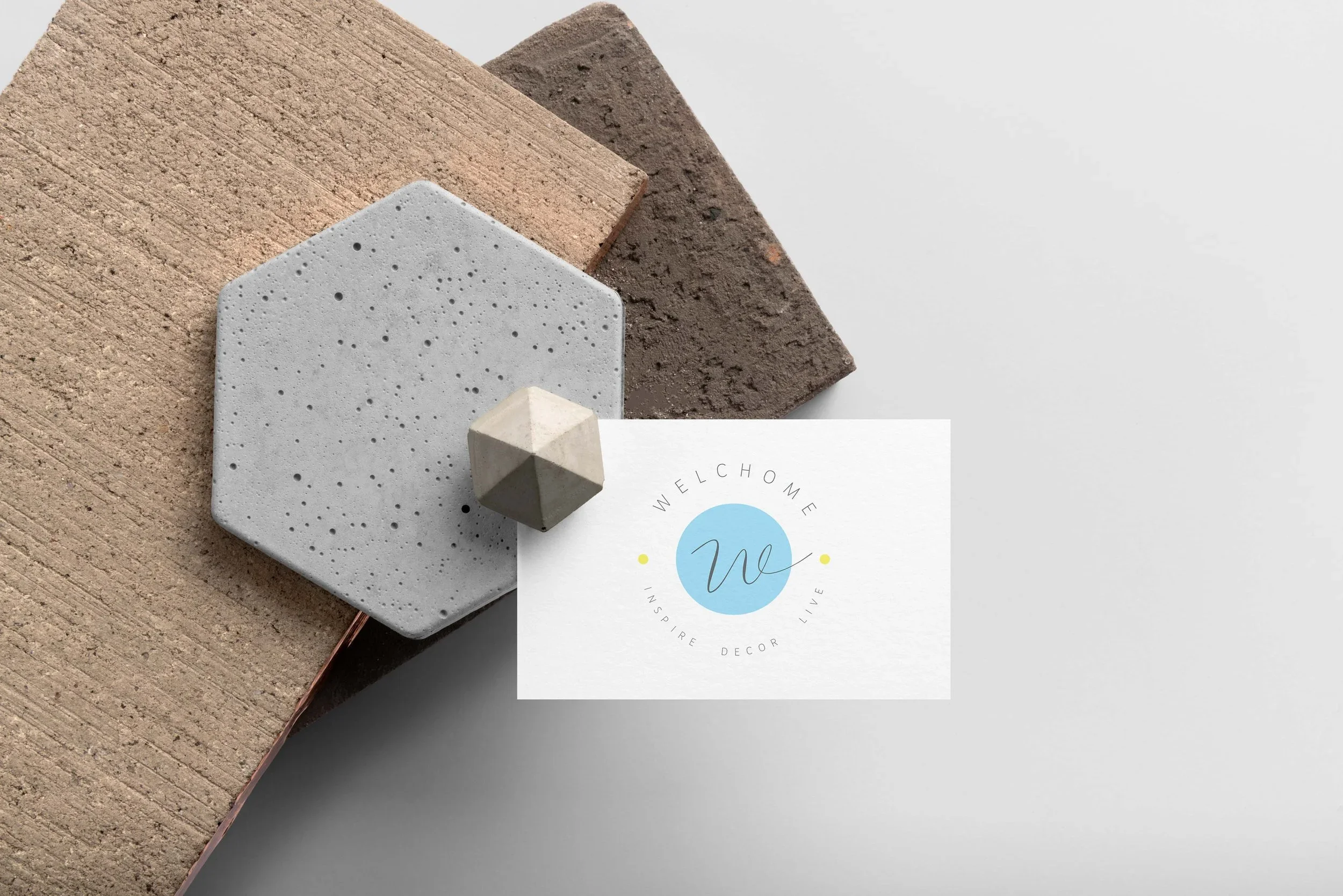
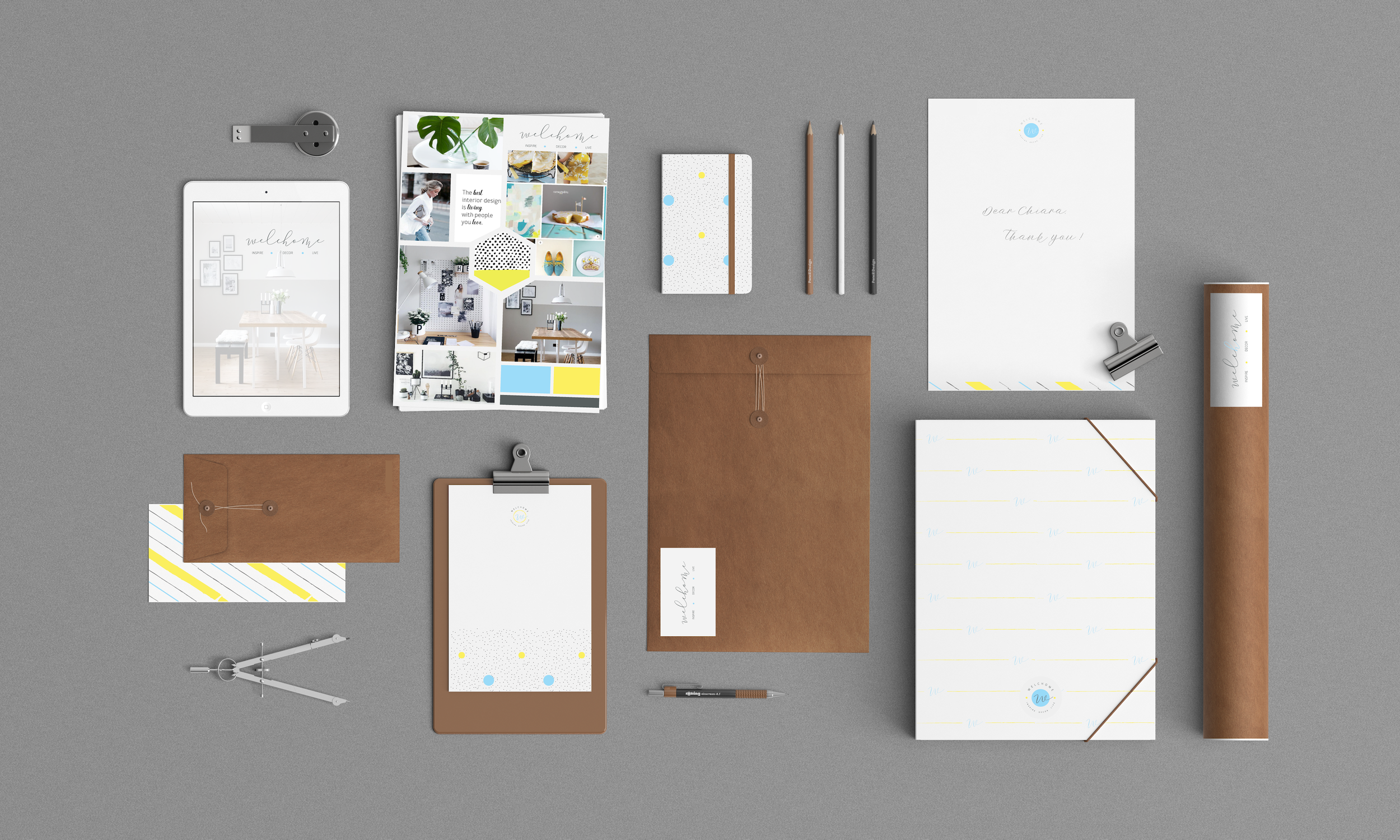
Within this context, my role focused on developing a visual identity for Welchome Store, an Italian interior decor online shop, that could mediate between global minimalist aesthetics and local Italian visual sensibilities.
The process included:
Conducting a brand discovery questionnaire to define values, audience expectations, and aesthetic direction
Developing a mood board to establish a coherent visual language balancing minimalism and expressive detail
Translating these insights into a structured brand identity system that could operate across physical and visual touch-points
Key design decisions included introducing:
a calligraphic icon to reference classical and expressive visual traditions
subtle colour accents to soften the strictness of minimalist composition
a refined balance between white space, structure, and ornamental detail
The resulting identity system included:
full brand identity guidelines
packaging pattern system
business card design
Designing a Visual Identity for Child-Centred Social Impact Systems
Translation (Intervention Lens)
Within this context, my role focused on developing a visual identity system capable of expressing both the playful, human-centred ethos of the studio and its broader social mission.
The process included:
Conducting a discovery questionnaire to clarify organisational values, audience, and aesthetic direction
Developing a mood board to define a coherent visual language balancing playfulness with clarity and minimalism
Translating strategic and emotional inputs into a structured brand identity system
Key design decisions included:
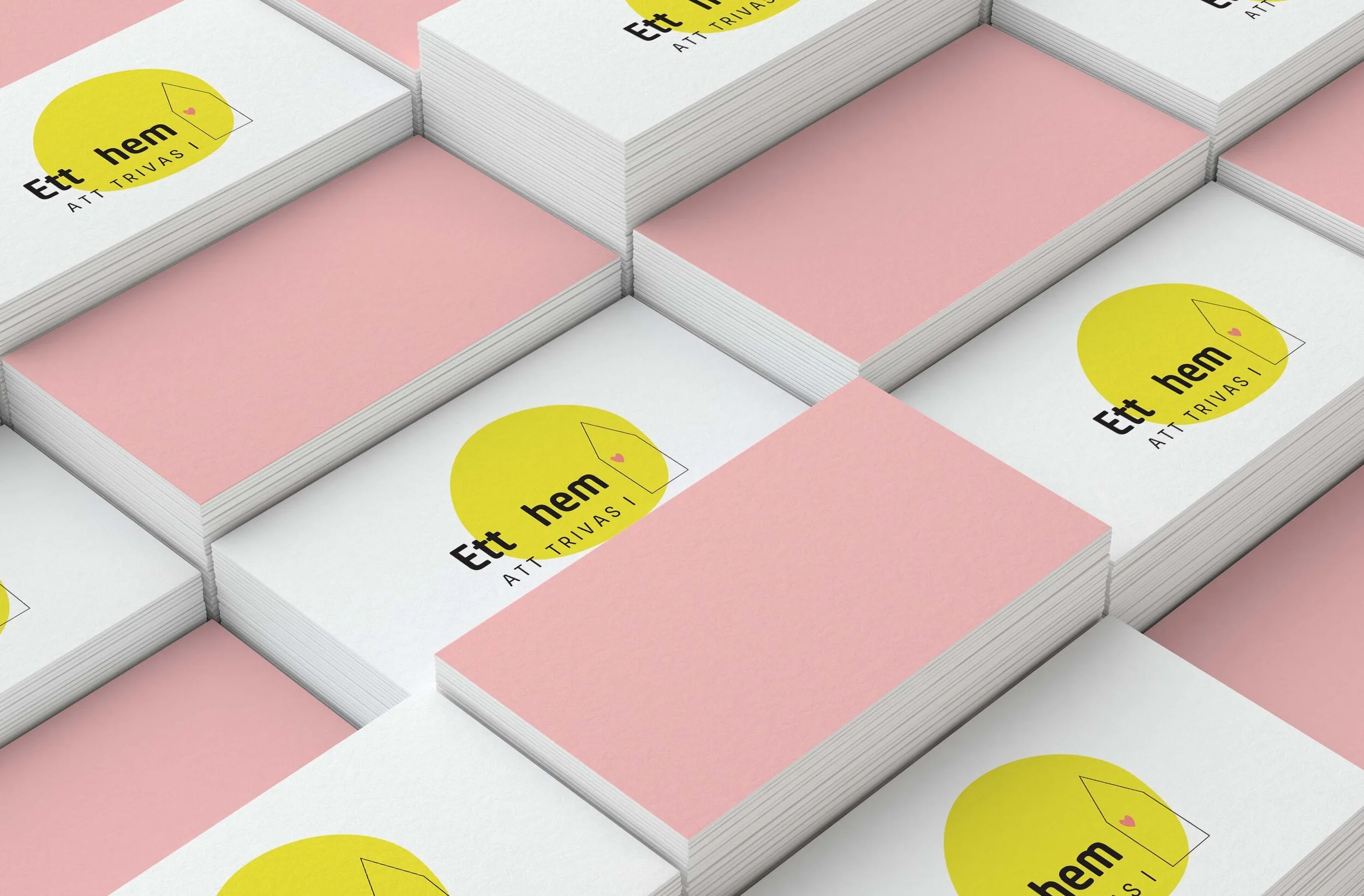
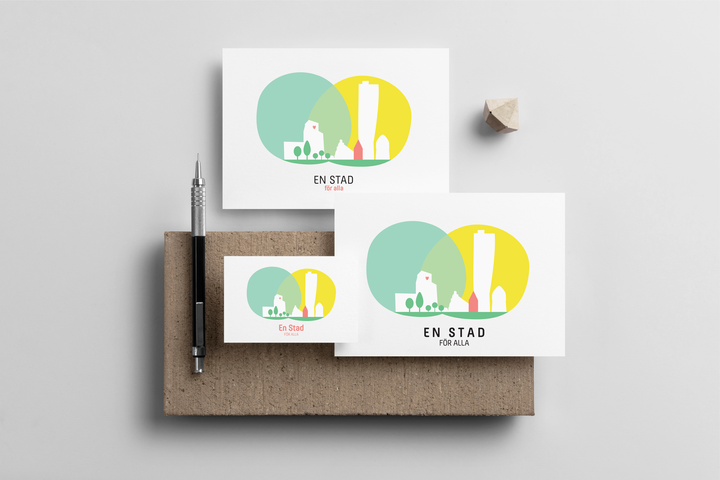
introducing a heart motif within the logo system to signal care, inclusion, and social purpose
maintaining a clean and modern visual structure to ensure accessibility and professional clarity
extending the identity into applied formats across communication and mobility assets
The resulting system included:
full brand identity guidelines
business card design
presentation PDF design
custom-designed vehicle decals for field operations
Output
The outcome was a brand identity system that:
articulated the organisation’s mission of child-friendly and socially inclusive design
translated emotional and social values into a coherent and scalable visual system
extended branding beyond traditional formats into spatial and operational touchpoints
supported the organisation’s positioning across both domestic and urban-level initiatives
strengthened the communication of its transition from interior-focused work to broader civic impact
Reflection
This project highlighted how branding can function as a bridge between aesthetic expression and social intention.
In socially driven design contexts, identity systems are not only tools of recognition, but also frameworks for communicating care, inclusion, and collective values.
It also reinforced how design language can scale—from domestic environments to urban systems—while maintaining a consistent underlying ethos of accessibility and human-centred thinking.
Cultural Signal
Across Northern European design culture, there is a historical intersection between design and well-being.
Within this space, a new type of design organisation emerges: studios that operate not only as aesthetic practitioners, but as agents of social impact, using visual identity to communicate values of care, accessibility, and collective well-being.
In particular, child-friendly design has become a lens through which broader questions of liveability, inclusion, and urban wellbeing are being reimagined, extending from domestic spaces into public infrastructure.
Interpretation for Ett Hem Att Trivas i + Ett Stad För Alla
This project sits at the intersection of branding and social design, where identity systems must communicate both emotional accessibility and institutional credibility.
The key challenge is to translate a social mission into a visual language that is:
approachable and emotionally resonant (child-friendly, warm, inclusive)
while remaining structured, minimal, and professionally coherent
At a deeper level, the project reflects a broader cultural shift: the expansion of “care-oriented design” from private domestic environments into collective urban and civic spaces.
Branding here becomes a vehicle for expressing not only organisational identity, but also social intention.
Cultural Signal
As digital products increasingly mediate children's learning experiences, concerns have grown around overstimulation, excessive screen engagement, and the cognitive effects of attention-driven design patterns.
At the same time, parents and educators are seeking digital environments that support learning while respecting children's emotional wellbeing, attention spans, and developmental needs.
This creates a growing space for educational products that prioritise calmness, clarity, and meaningful engagement over constant stimulation.
Interpretation for Paw Math
Many educational apps rely on bright visual stimuli and rapid interactions to maintain engagement. While effective at capturing attention, these approaches can sometimes compete with the learning process itself.
This project explored an alternative perspective: that engagement can emerge from emotional comfort, visual clarity, and a sense of safety.
Rather than treating learning as a challenge to be gamified, the design sought to create a supportive environment where children could explore mathematical concepts at their own pace, without unnecessary cognitive or visual overload.
At a broader level, the project reflects a growing cultural interest in designing digital experiences that support wellbeing alongside performance.
Translation (Intervention Lens)
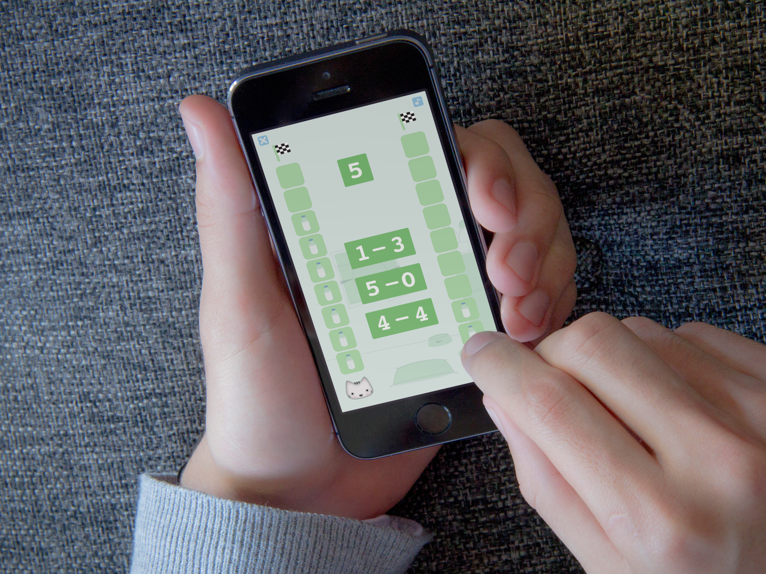
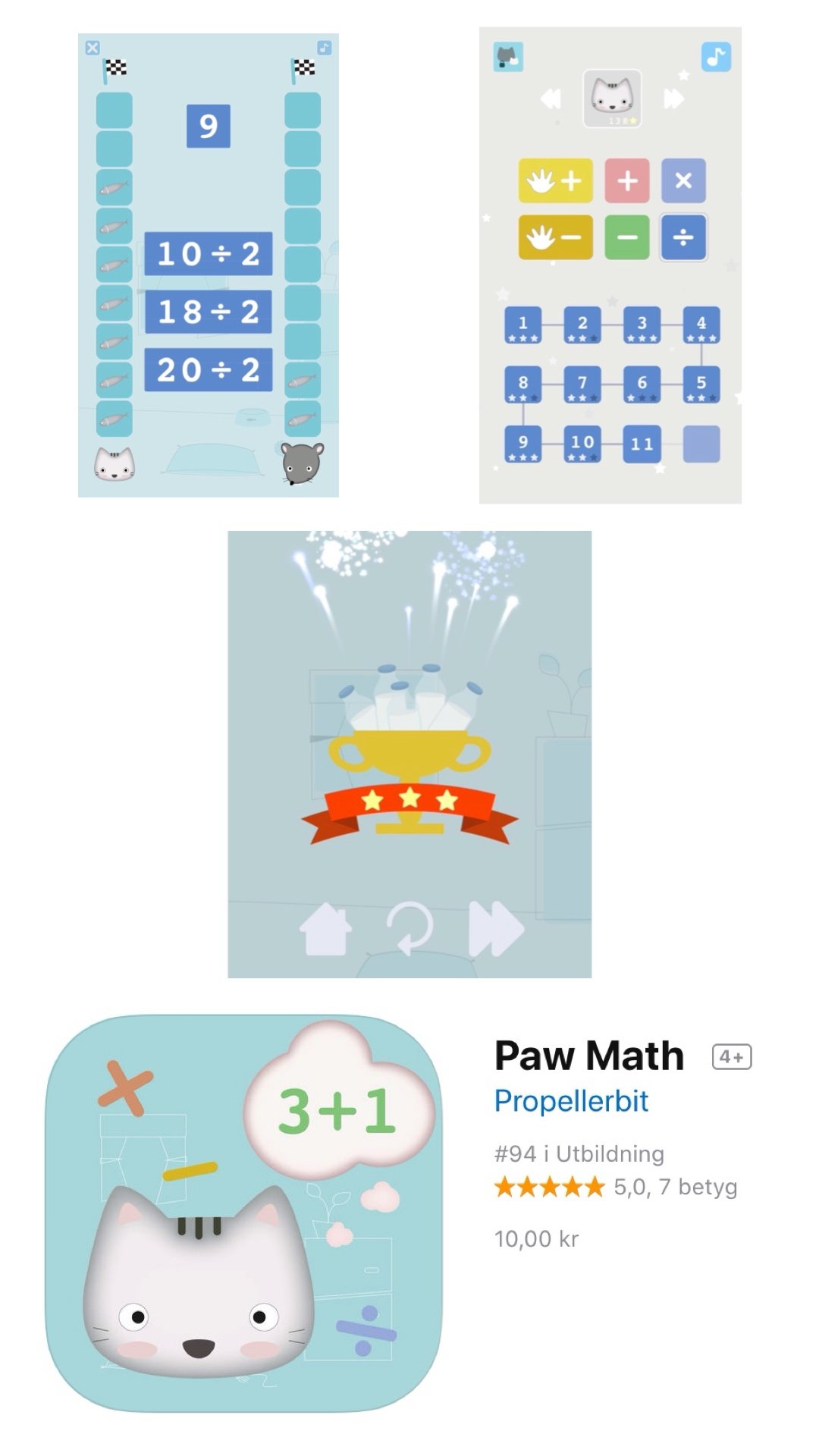
Developed in collaboration with the Swedish software company Propeller Bit, Paw Math emerged from a personal observation: despite the abundance of educational applications available, few combined effective learning experiences with a calm and visually gentle design language.
My contribution focused on translating this insight into a coherent visual and interaction system.
This included:
Developing the app's visual identity, illustration style, and graphic assets
Creating a visual language based on soft colours, approachable characters, and simple forms
Designing user interface elements that prioritised clarity, accessibility, and ease of navigation for young learners
Contributing to an overall experience that balanced educational goals with emotional comfort
The project aimed to create a digital environment where mathematics could feel approachable, encouraging, and enjoyable.
Output
The resulting application provided:
a cohesive visual identity designed specifically for young children
a calm and accessible interface supporting independent exploration
an illustration system that reinforced learning through familiarity and emotional connection
a digital learning environment balancing educational effectiveness with visual restraint
The project demonstrated how educational technology can engage children without relying on high-stimulation design patterns.
Reflection
This work reinforced the idea that design shapes not only how people use products, but how they experience and remember them.
Particularly in children's digital environments, visual and interaction design influence emotional states as much as functional outcomes.
The project highlighted the value of designing for trust, comfort, and confidence—showing that educational experiences can be engaging not because they demand attention, but because they create the conditions for curiosity and learning to emerge naturally.
Designing a Gentle Learning Environment Through Digital Play
Cultural Identity Systems
Brands, products, and services do more than communicate information—they express cultural values, aspirations, and ways of relating to the world.
The projects in this section explore how identity is constructed and communicated through visual, material, and digital systems. Whether developing a brand for a children's footwear company, a social-impact initiative, a home décor venture, or a digital learning experience, the focus remains the same: understanding the cultural context in which people live and translating those insights into coherent experiences.
Across these projects, branding is approached not as the creation of logos or visual assets alone, but as a process of cultural translation. Each identity system emerges from an exploration of the beliefs, aesthetics, behaviours, and aspirations that shape how individuals connect with products, organisations, and ideas.
Together, these works investigate how design can transform abstract values into recognisable forms, creating experiences that are both meaningful and culturally resonant.