Brand & Visual Narratives
Creating coherent brand identities and visual worlds.
See below some examples of branding work done for clients in the design space, and some illustration work done during the years.
Branding & Re-branding case studies
Re-branding the whimsical
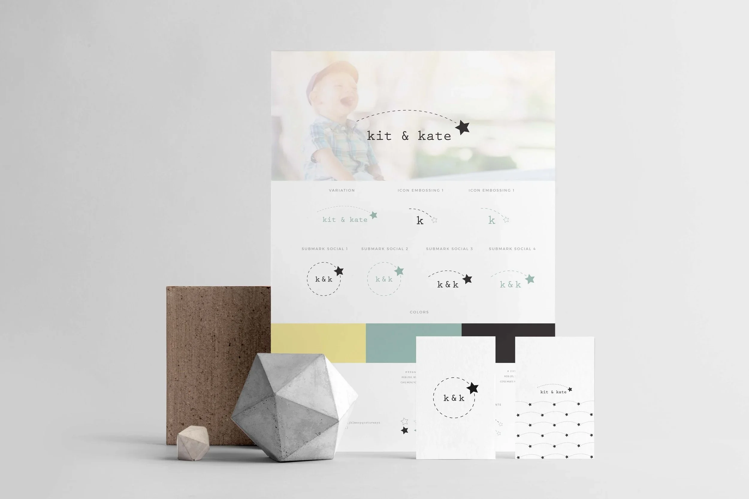
Kit & Kate
Kit & Kate is a well-established Australian on-line shop selling premium (possibly the best!), handmade children’s shoes.
Challenge
When our collaboration started, Kit & Kate was in a growth phase and was looking into redefining its brand identity into a whimsical, yet minimalist one which could appeal to its design conscious customer base. The challenge was to modernise the brand’s look without moving too far from the overall vibe of its original logo.
My Contribution
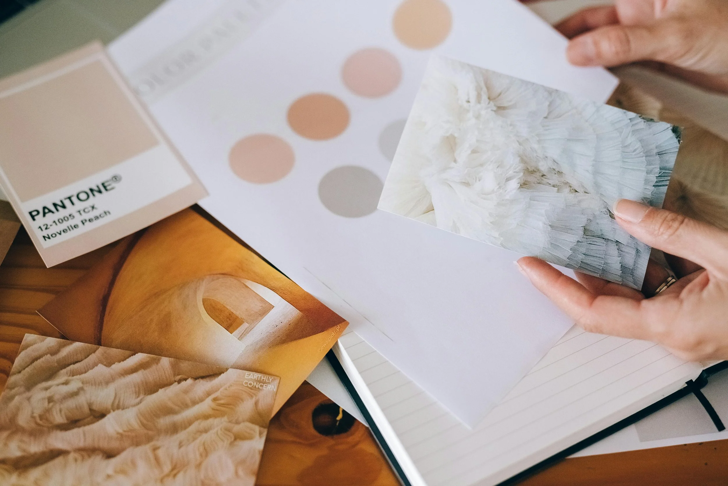
The re-branding work started from a discovery questionnaire, meant to help the business owner brainstorm on values and customer base. This phase was followed by the creation of a mood board, meant to visually direct the brand’s future vision. The final work resulted in:
Full brand identity guide
Packaging design
Business cards design
Branding the minimal but not-so-minimal
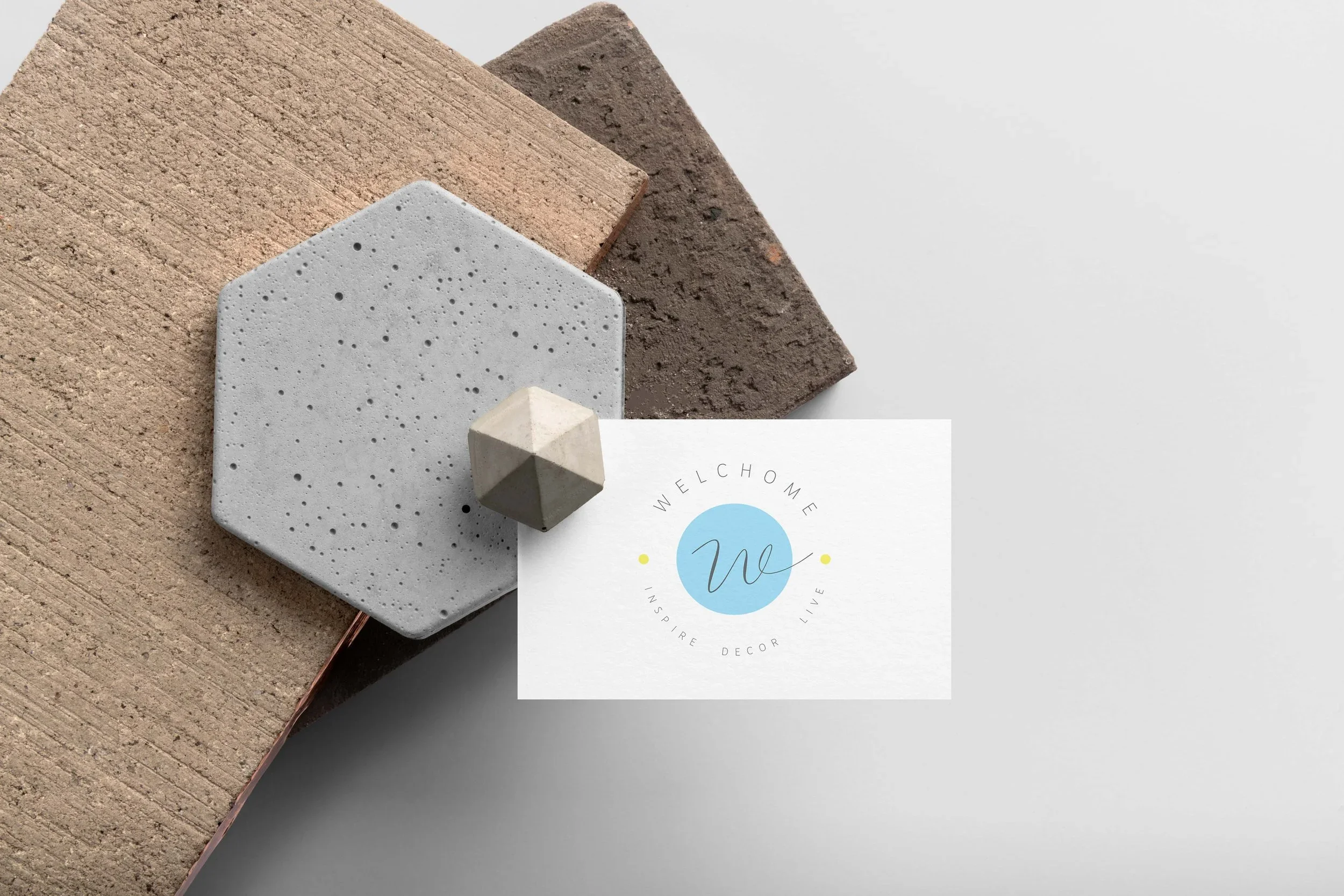
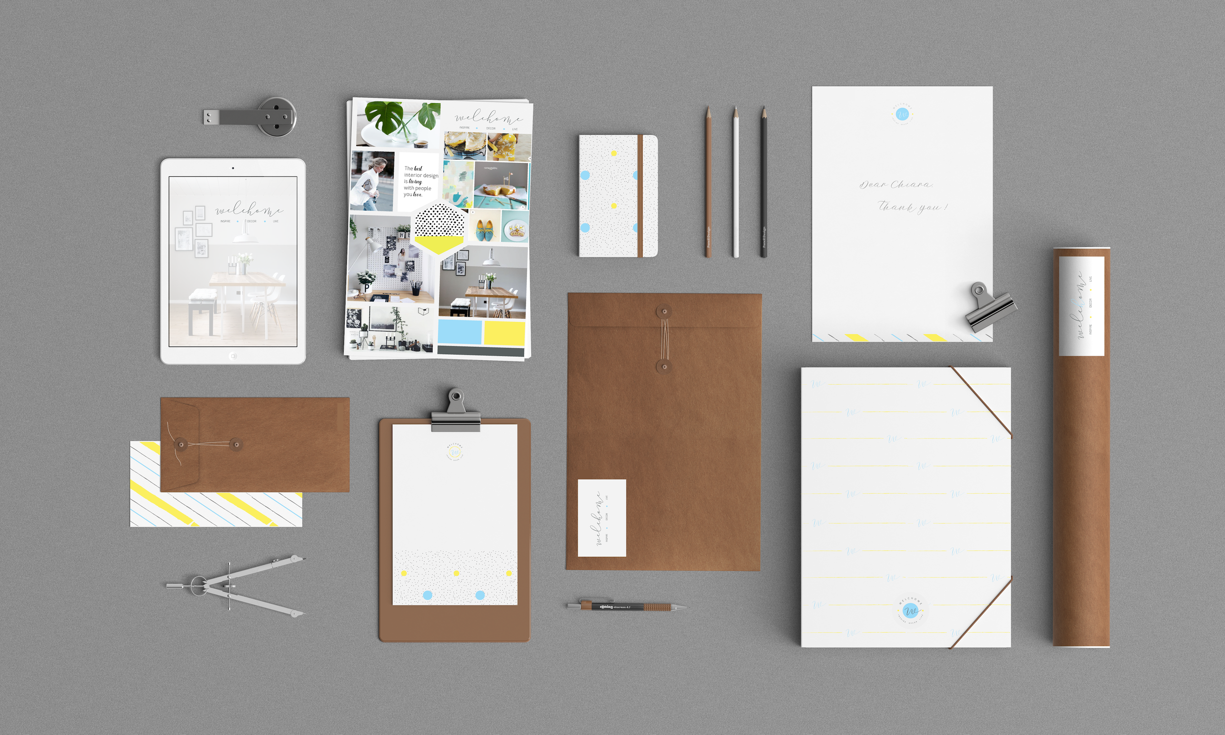
Welchome Store
Welchome Store is an Italian home decor shop selling Nordic and minimalist French products. The business owner contacted me at the beginning of the venture to create a visual identity for the brand.
Challenge
While the store was catering to people who enjoyed Nordic design, the challenge was to create a brand identity that would please an Italian taste. We avoided a purely minimalist look and added a touch of classical flavour (with a calligraphic icon), and some spots of colour.
My Contribution
The branding process started wth a questionnaire to lay down brand values, preferred colours and ideal customers. This phase was followed by the creation of a mood board.
The final work resulted in:
Full brand identity guide
Pattern for packaging
Business cards design
Branding design ideas for social impact
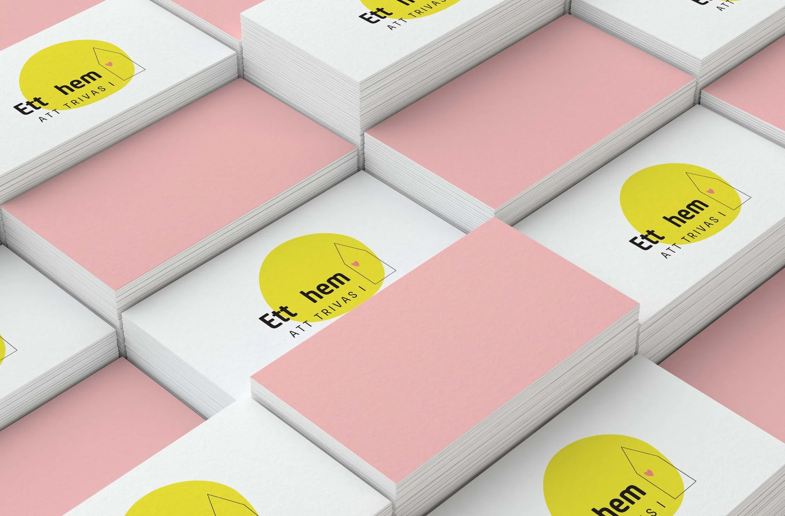
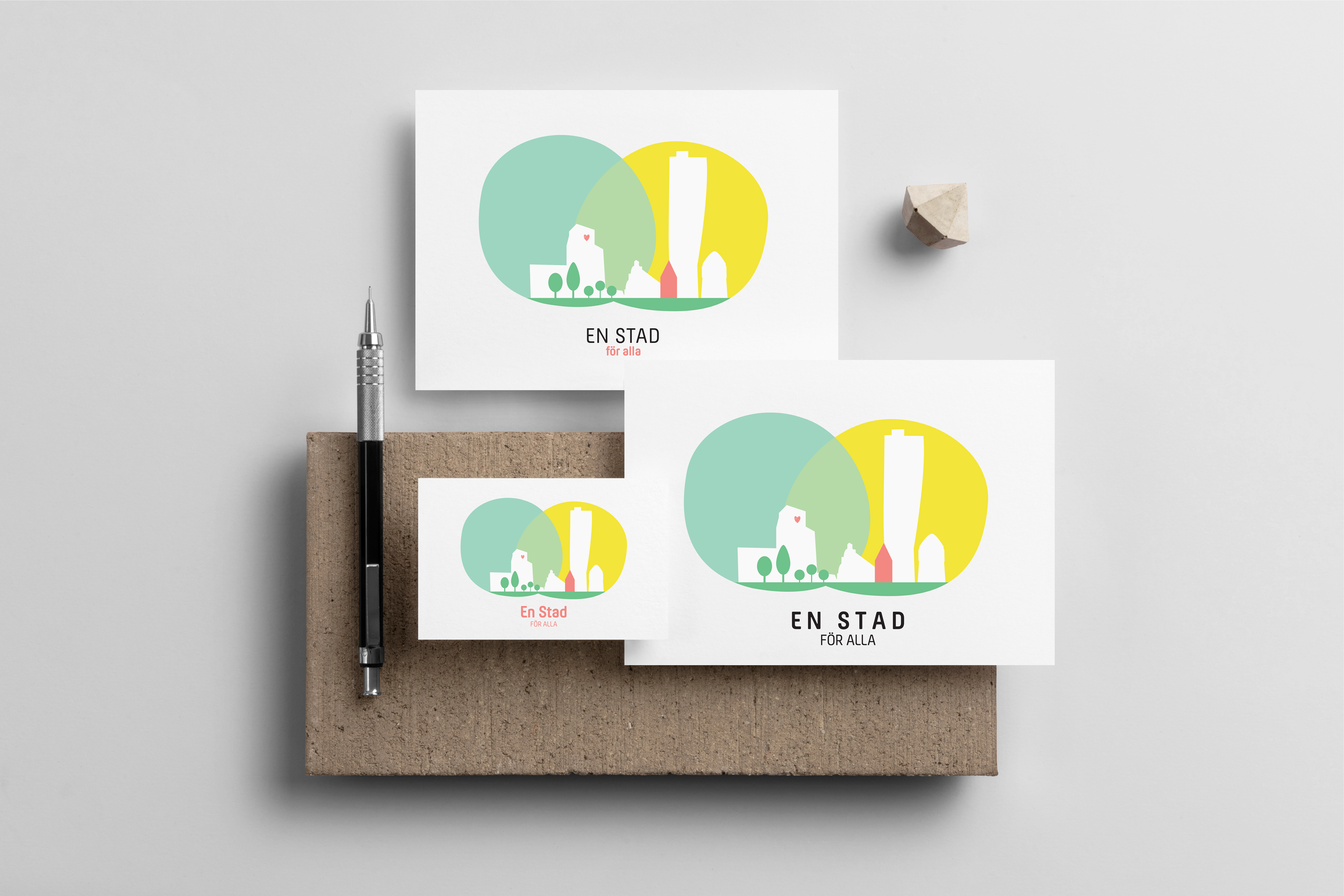
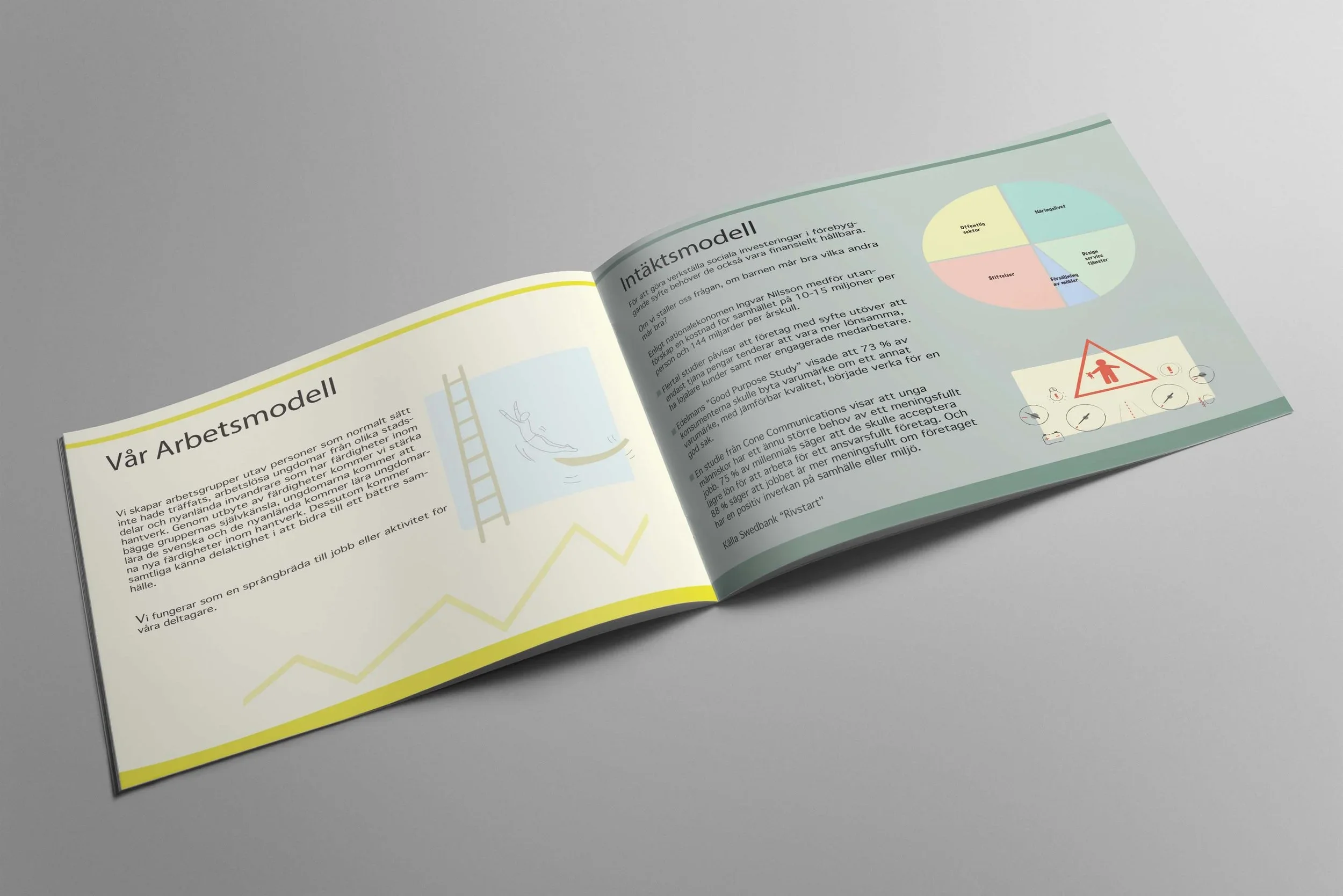
Ett Hem Att Trivas I + En Stad För Alla
Ett Hem Att Trivas I is a Swedish no-profit interior design studio with the goal of turning every home into a child-friendly environment. The project then scaled up to turning cities into more liveable spaces, thus creating En Stad För Alla.
Challenge
The design studio needed to create a brand identity that would show its love for fun and child friendly design, while keeping the style clean and modern. It also wanted to show its mission-for-good, which led to the add of a heart in the logo design.
My Contribution
The branding process started wth a questionnaire on the studio’s values, preferred colours and target customers. This phase was followed by the creation of a mood board.
The final work resulted in:
Full brand identity guide
Business cards design
Presentation pdf design
Custom-designed decals to add on the vehicles used by the studio
Some other branding projects
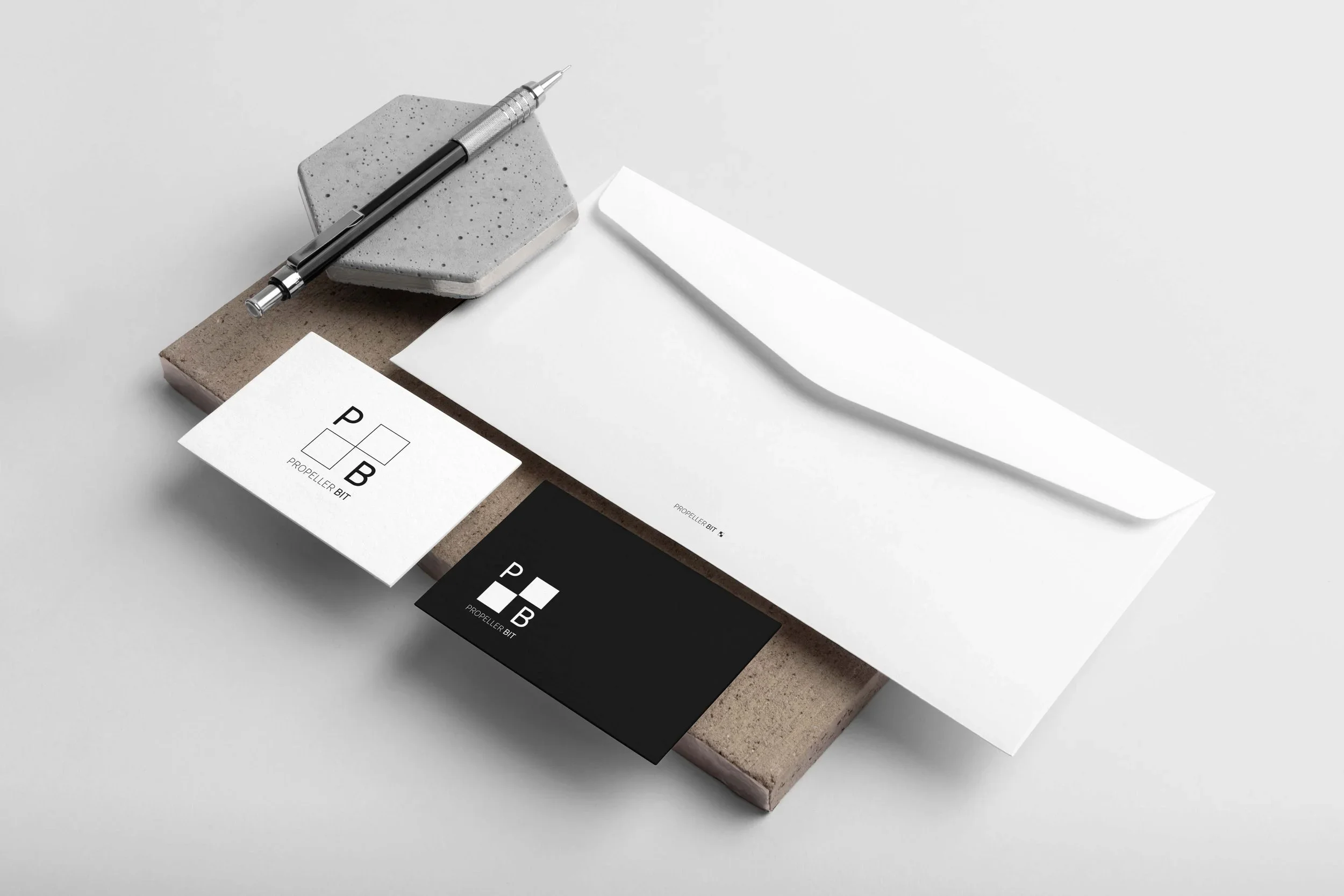
Propellerbit AB (Software Company)
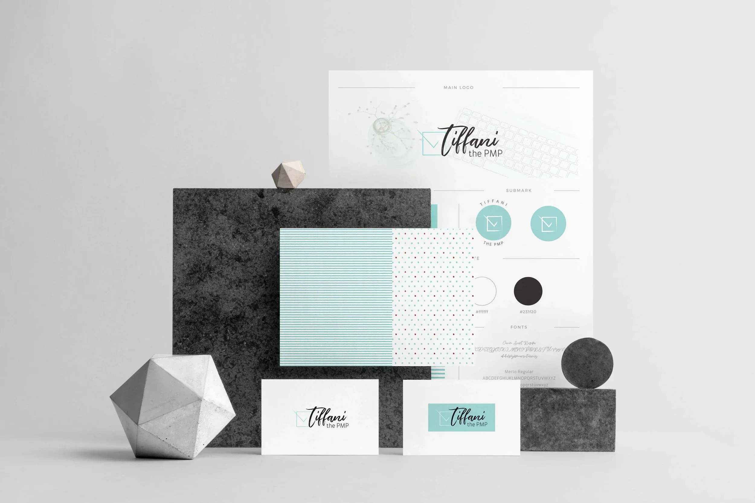
Tiffany the PMP (Consultancy Firm)
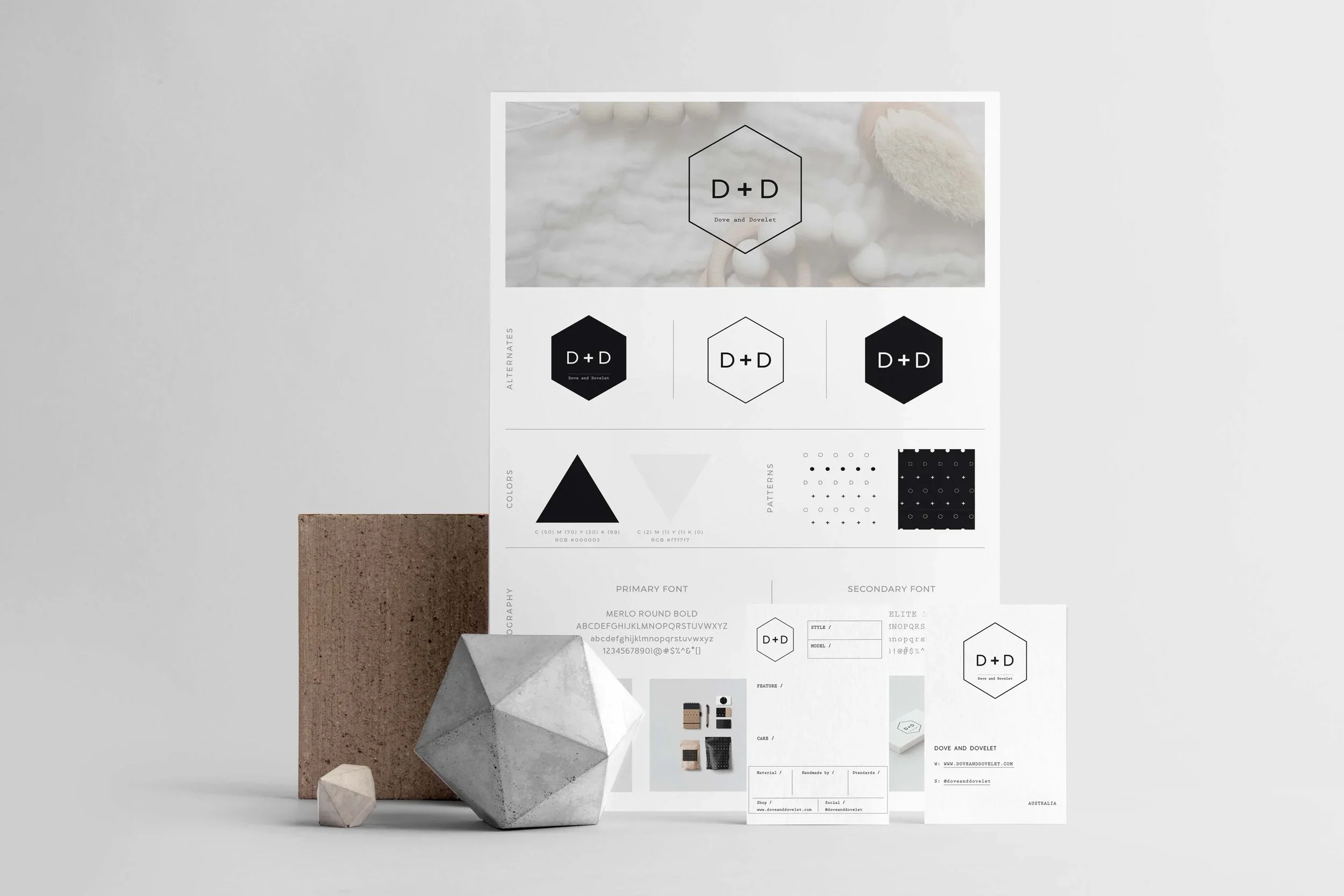
Dove & Dovelet (Kids' Accessories)
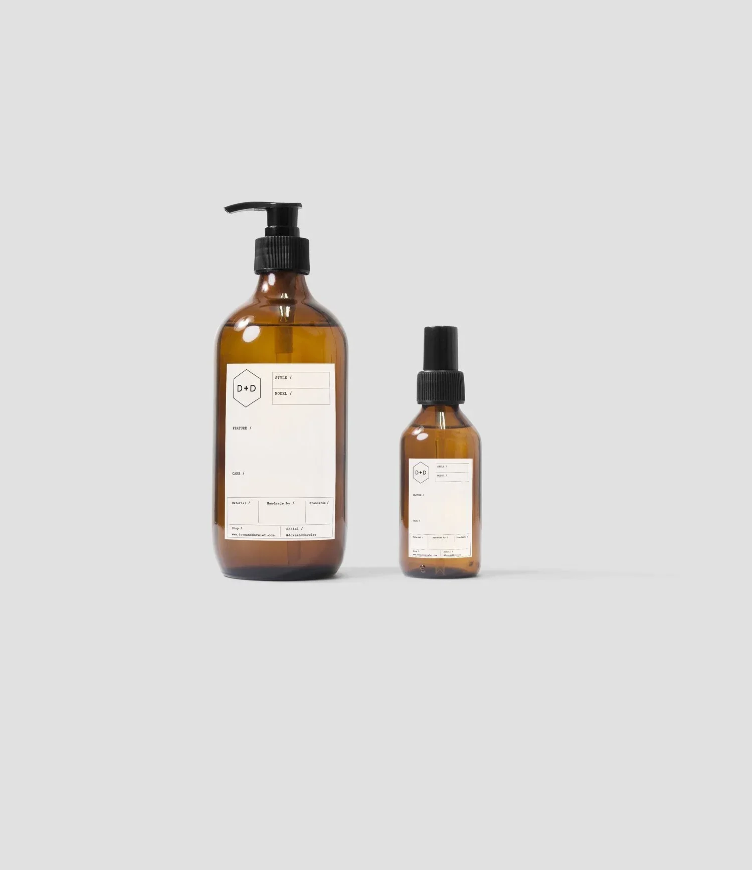
Dove & Dovelet labels
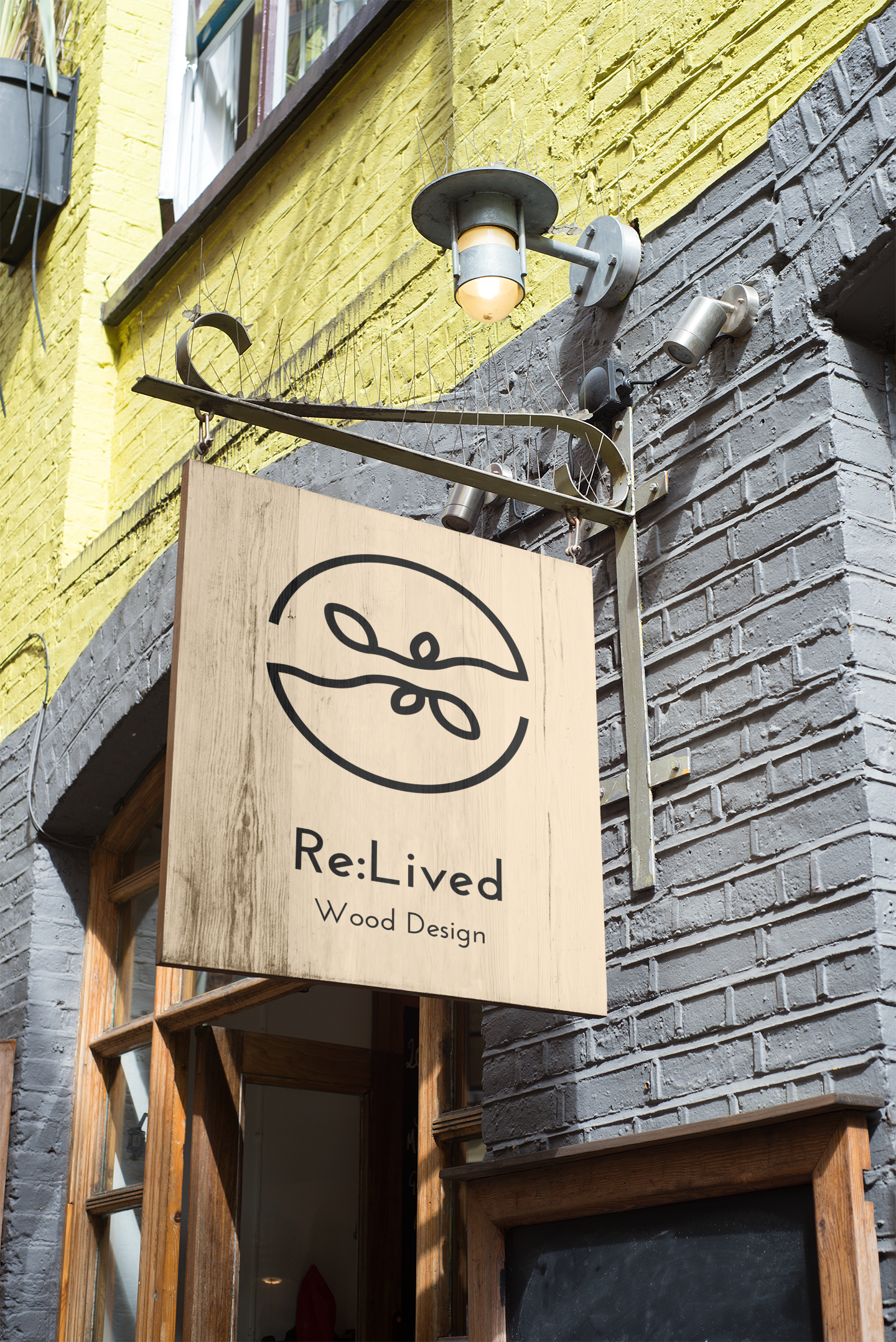
Re:Lived (Wood Artist)
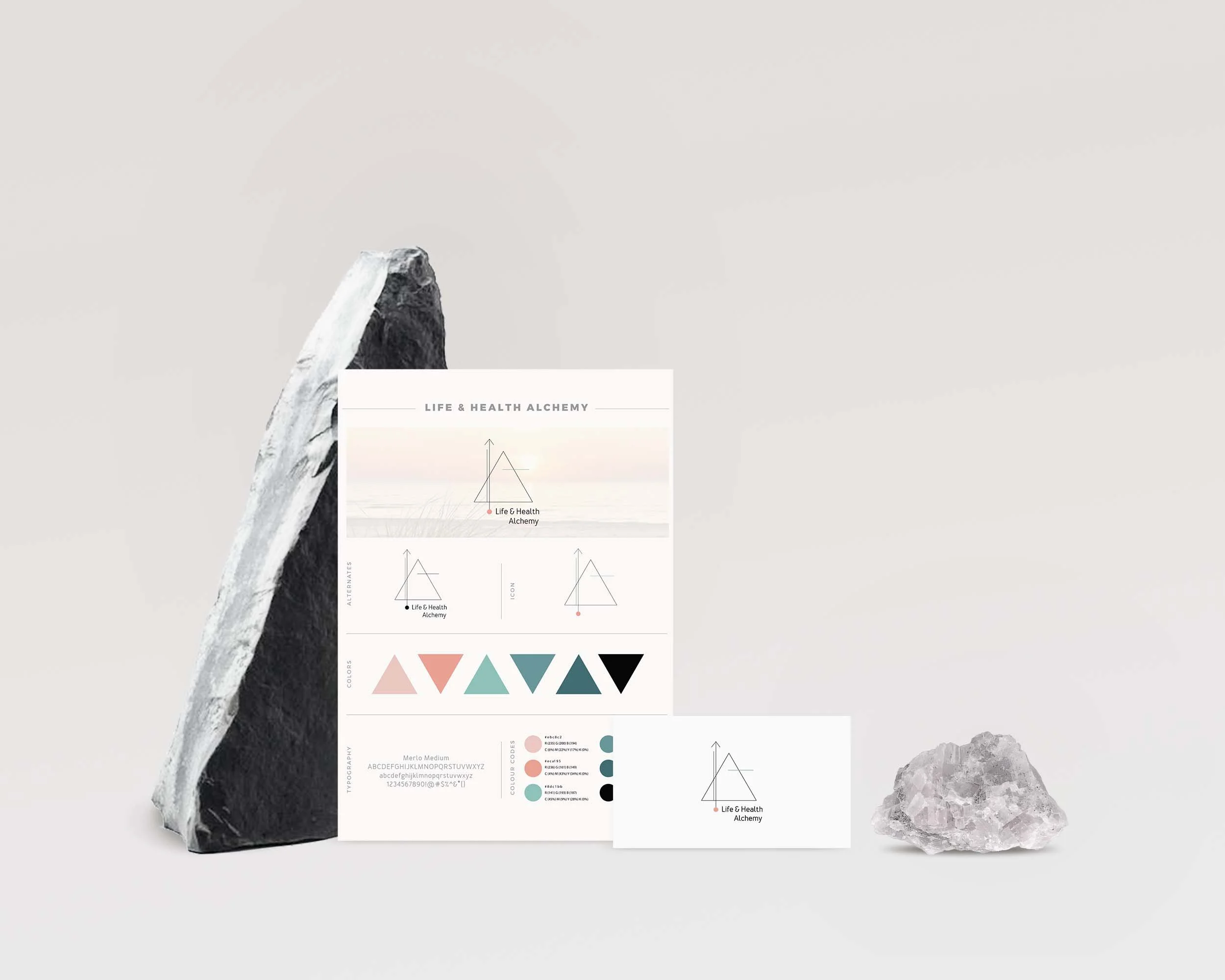
Life & Alchemy (Wellness Coach)
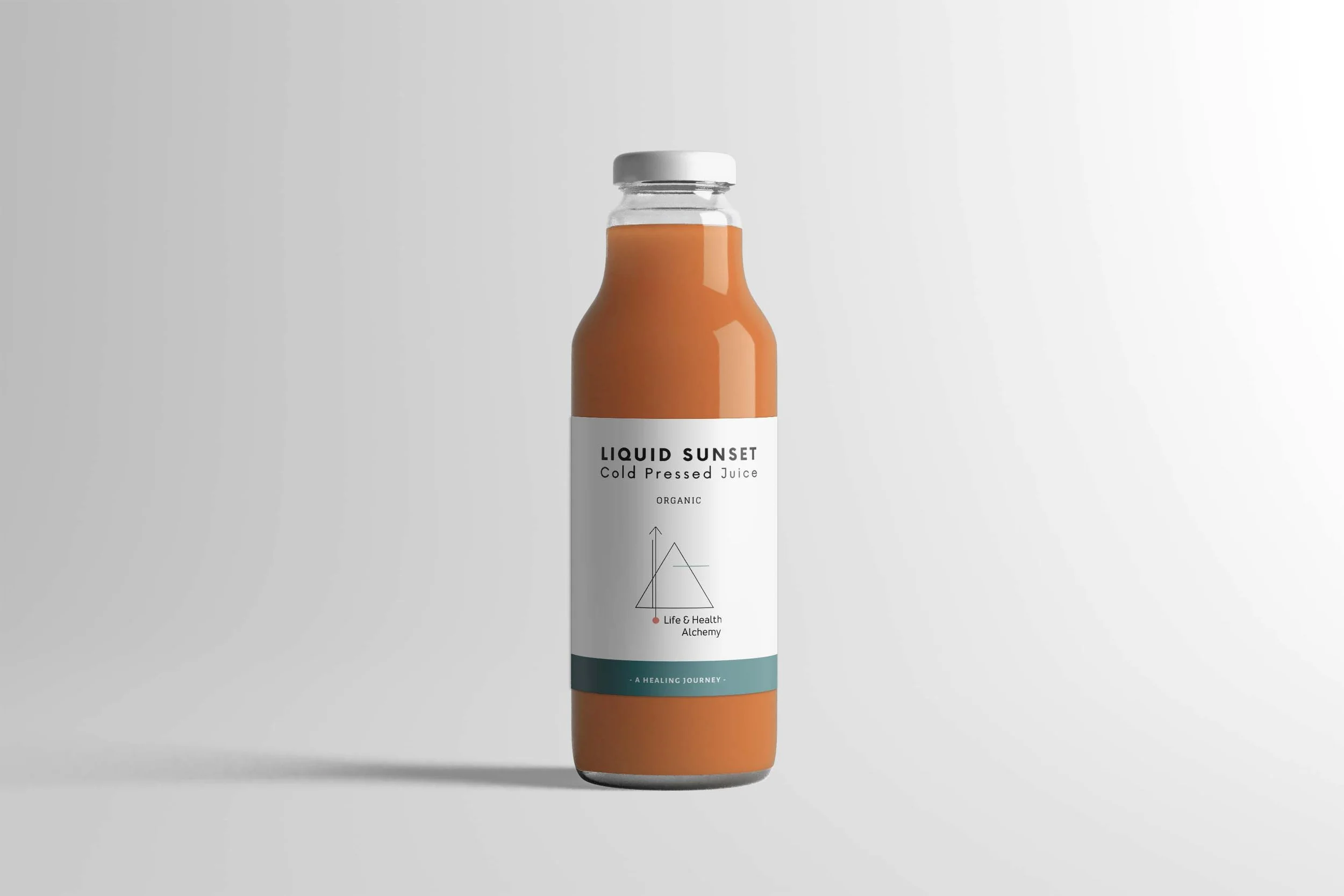
Life & Alchemy labels
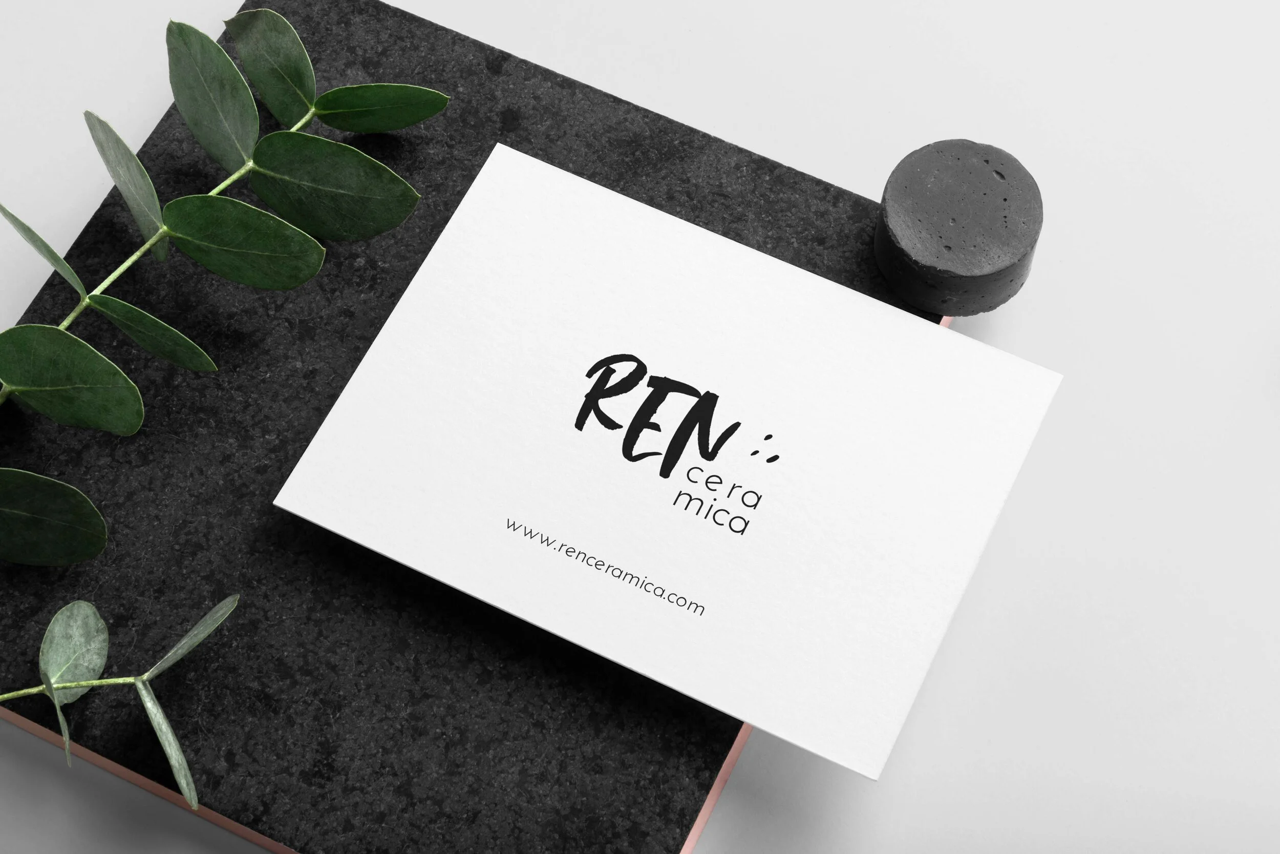
Ren Ceramica (Clay Artist)
App graphics
Designing a gentle learning experience for children
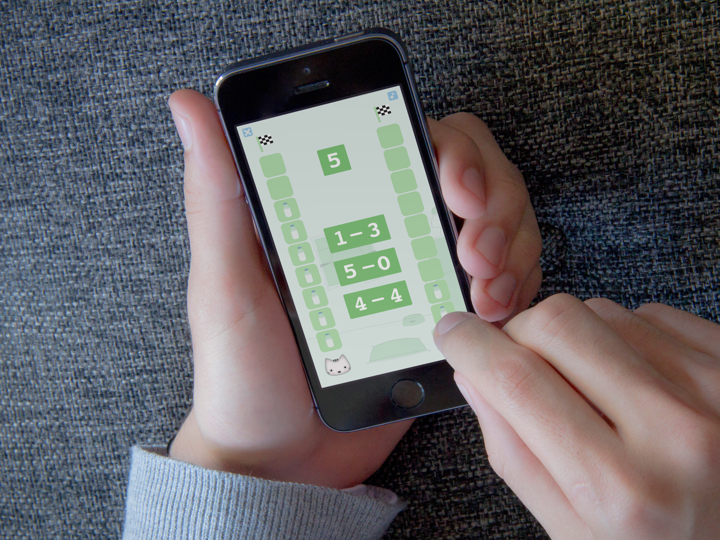
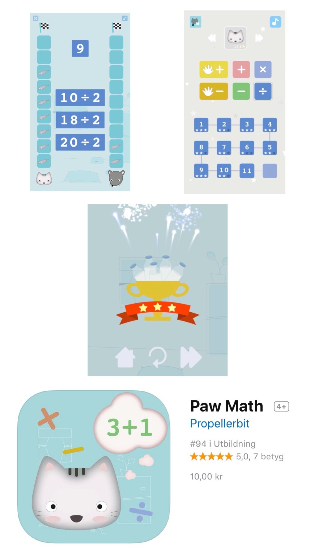
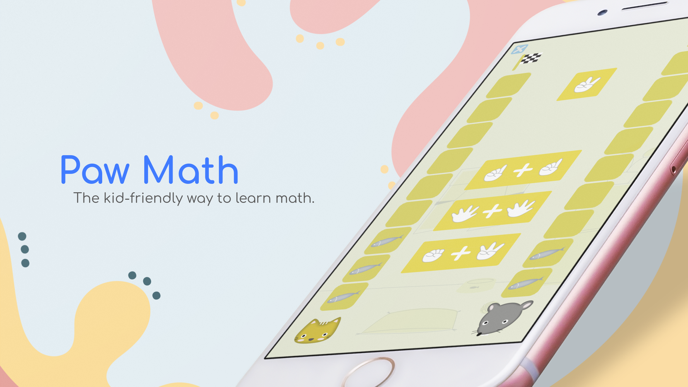
PAW MATH
Context
As a side personal project, I developed with the Swedish software firm Propeller Bit, an educational math app for children. Being a mother of two young children at the time, I was looking on the market for apps that would suit my needs of educational + soft graphics. I could not find any, and so the idea for Paw Match was born.The project sought to create a digital environment where learning mathematics could feel approachable, engaging, and enjoyable for young learners.
Challenge
Educational products for children often compete for attention through bright colours, animations, and constant stimulation. The challenge was to create an experience that remained engaging while avoiding visual overload. The design approach prioritised clarity, accessibility, and emotional comfort over visual stimulation, creating a calm and supportive space for exploration and learning.
My Contribution
Developed the app's visual identity, illustration style, and graphic assets.
Created a cohesive visual language based on soft colours, simple forms, and approachable characters.
Contributed to the design of user interfaces that prioritised clarity and ease of navigation for young users.
Reflections
Design has the ability to shape not only how people use a product, but how they feel while using it. Working on this project reinforced the importance of emotional design, particularly when creating experiences for children.
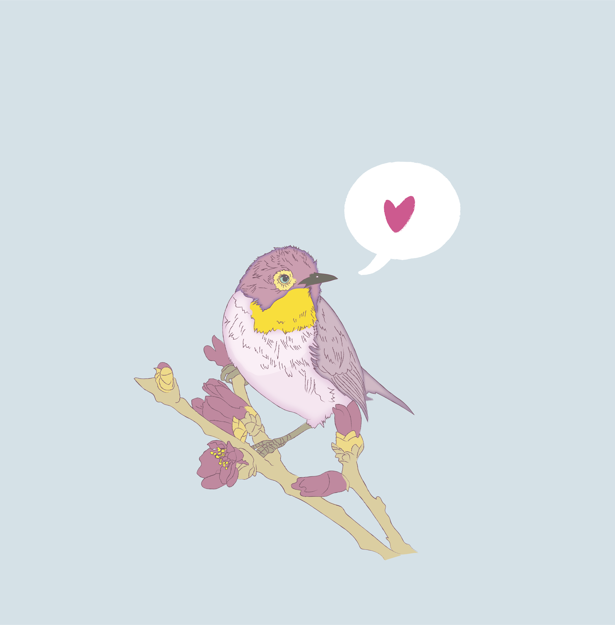
Illustrations
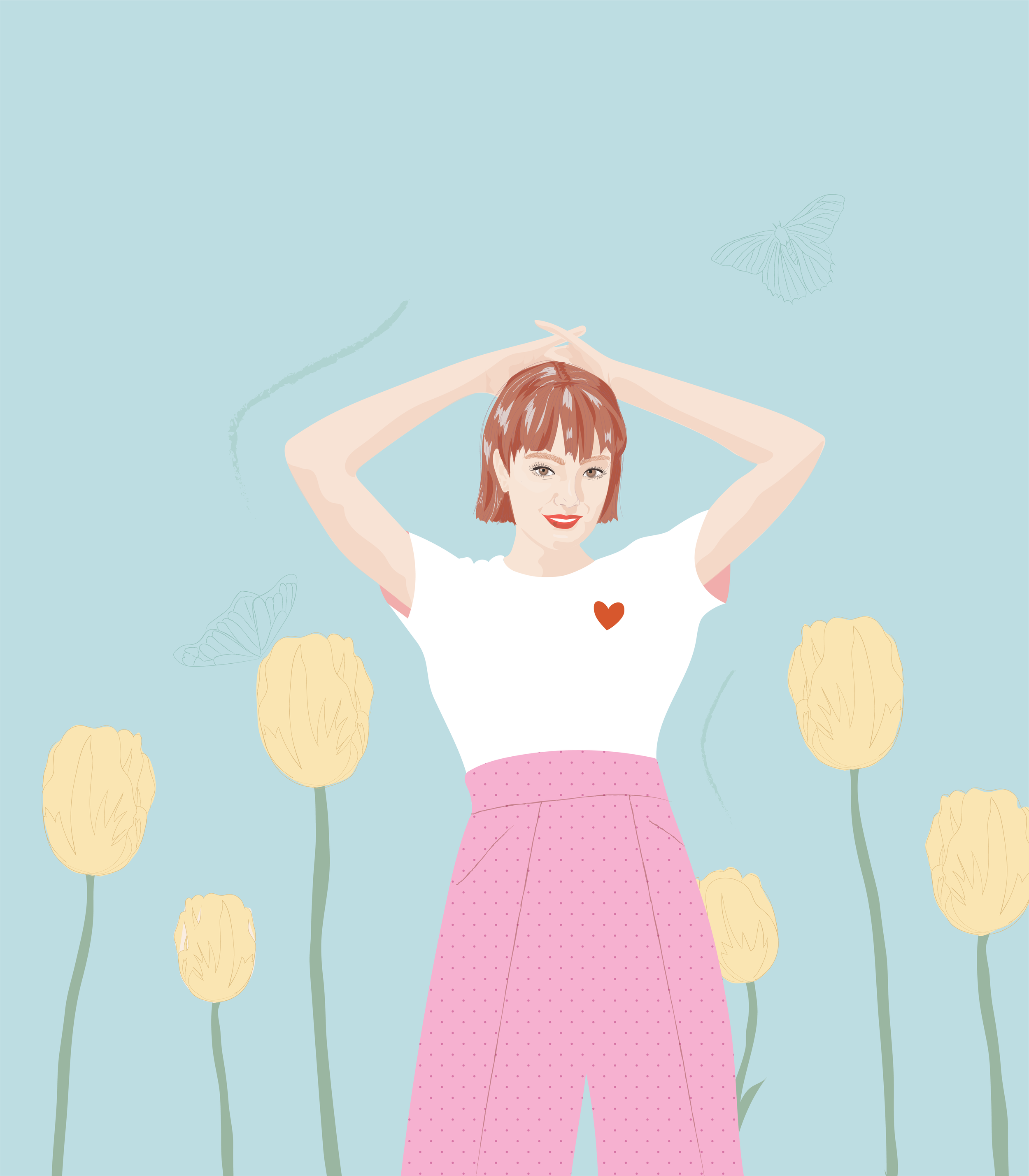
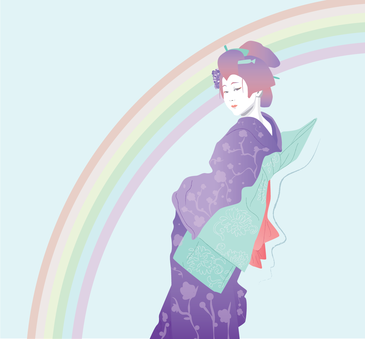
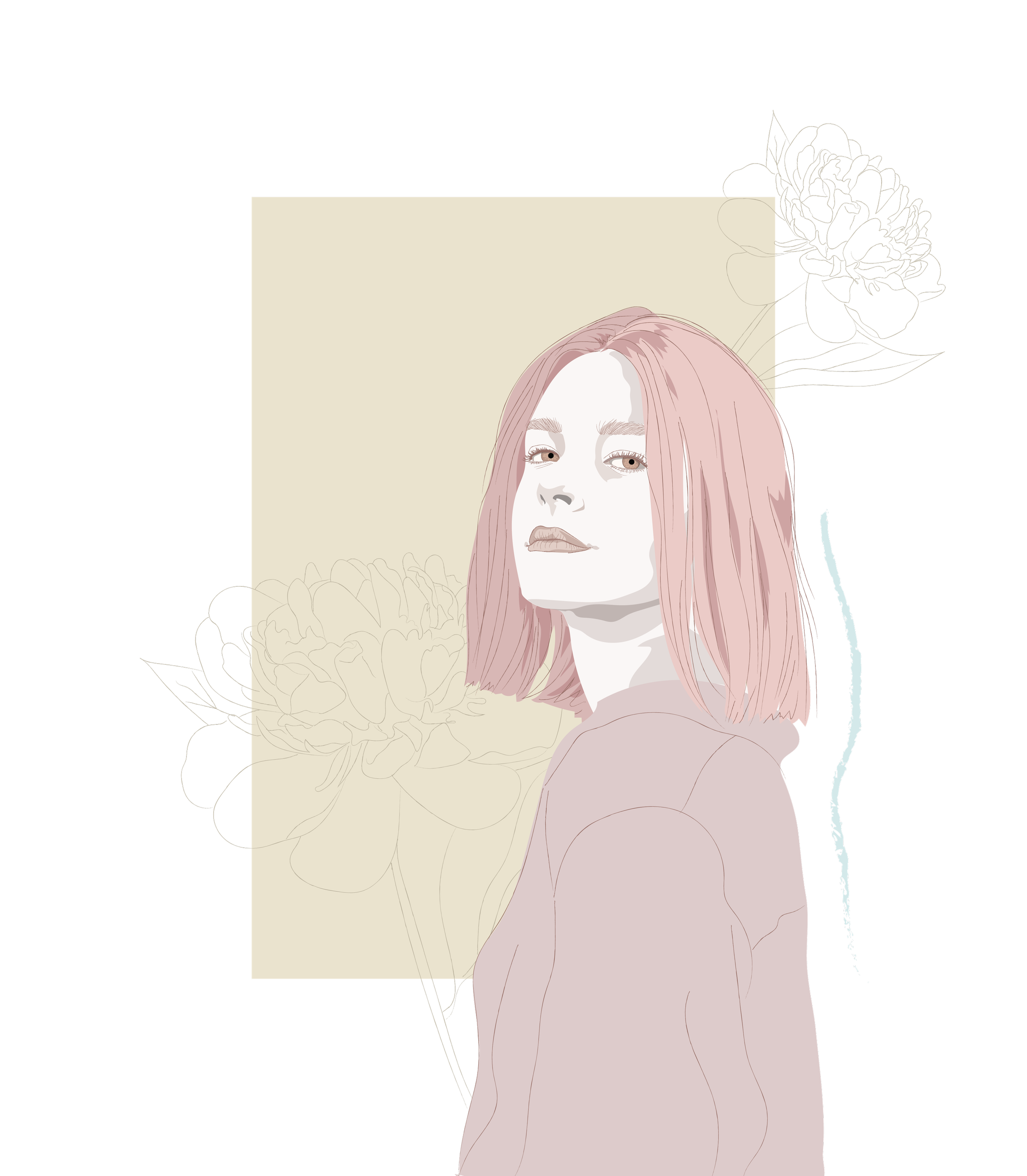
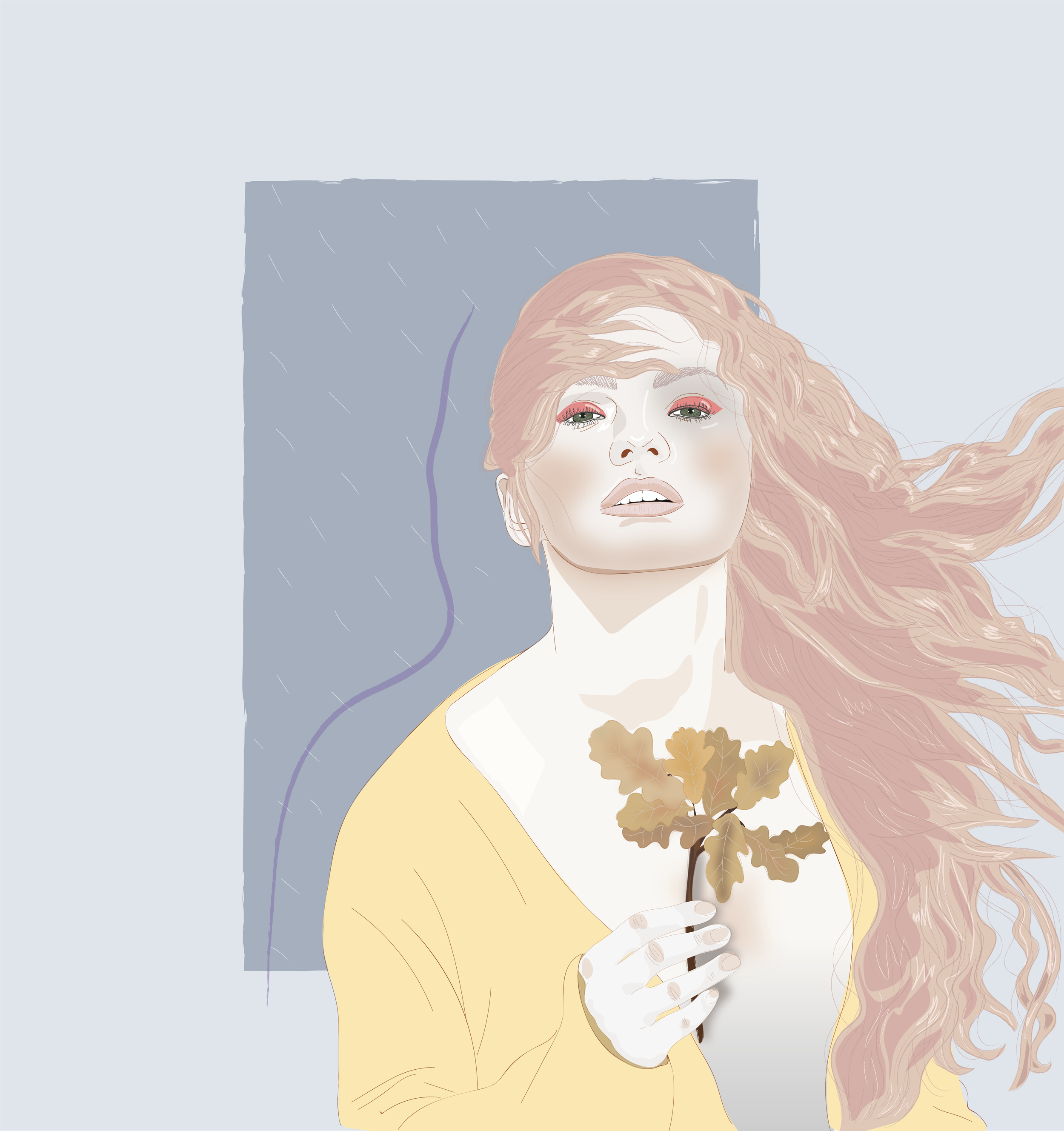
Whimsical girls in whimsical worlds
A series to celebrate imagination and whimsical thinking. All illustrations created with Adobe Illustrator.
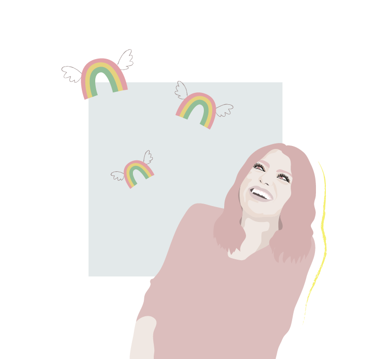
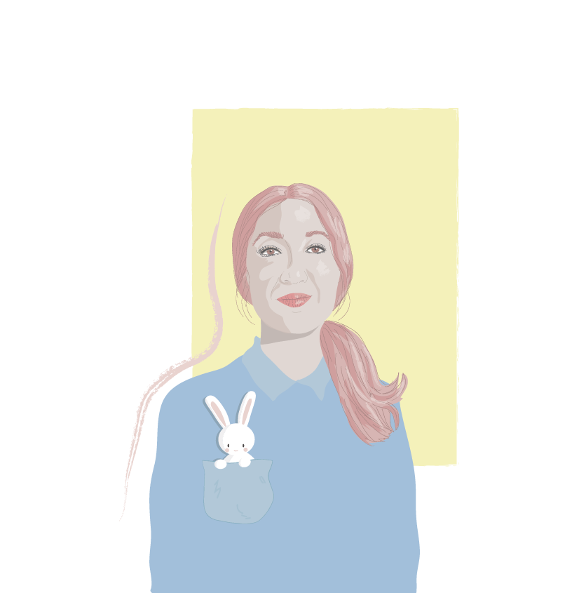
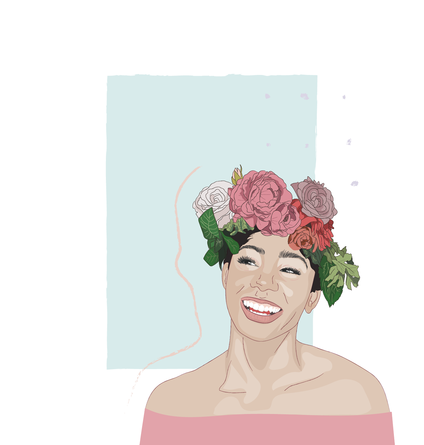
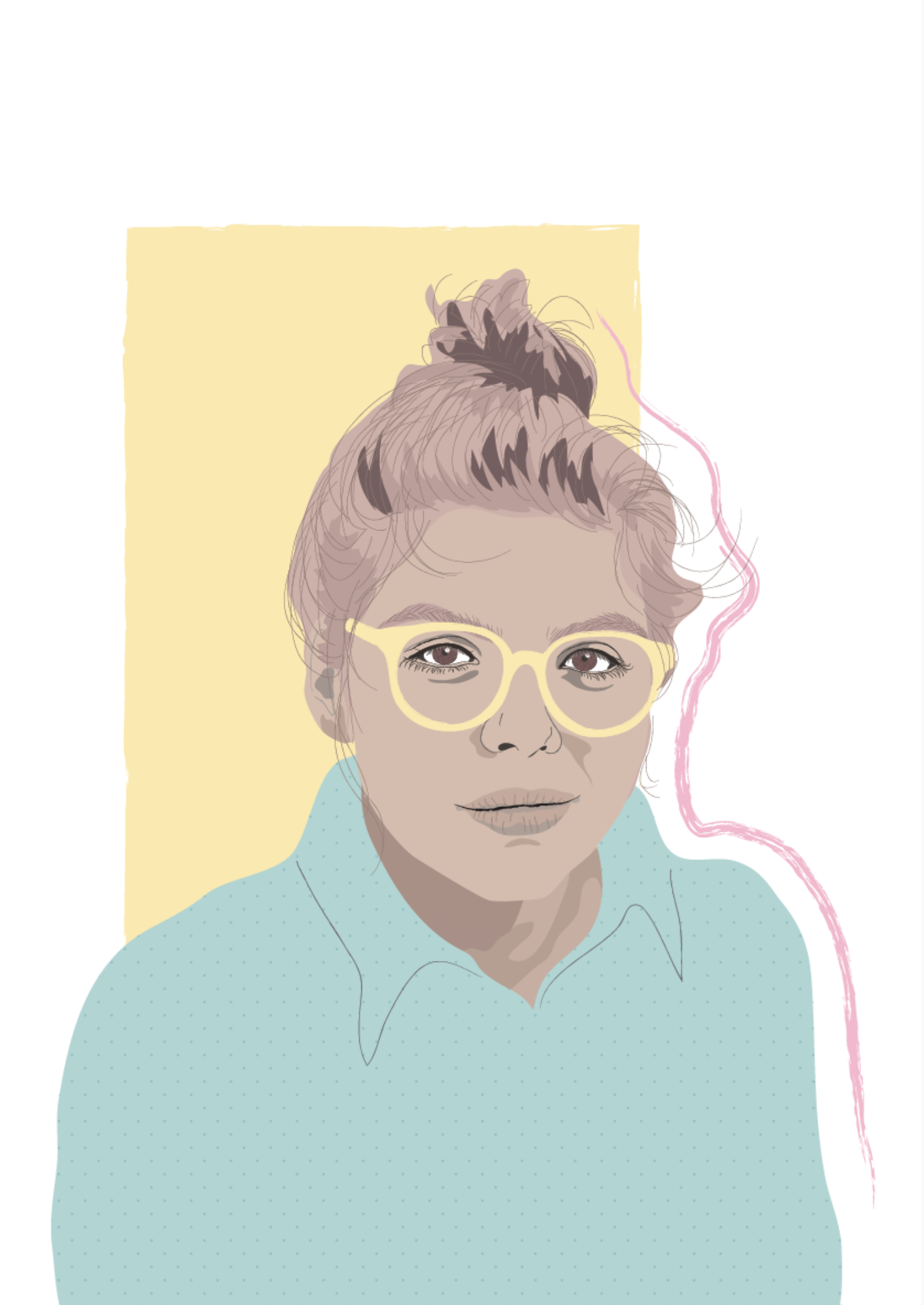
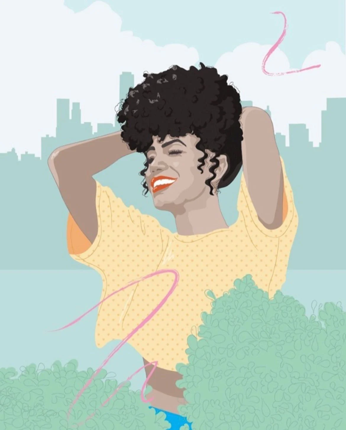
Women’s Portraits
A series celebrating fierceness and happiness. All illustrations made with Adobe Illustrator.
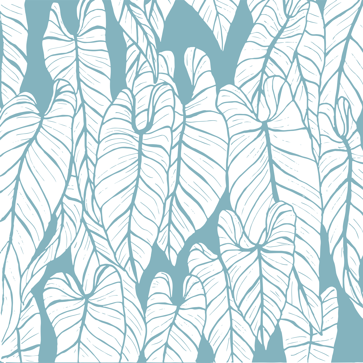
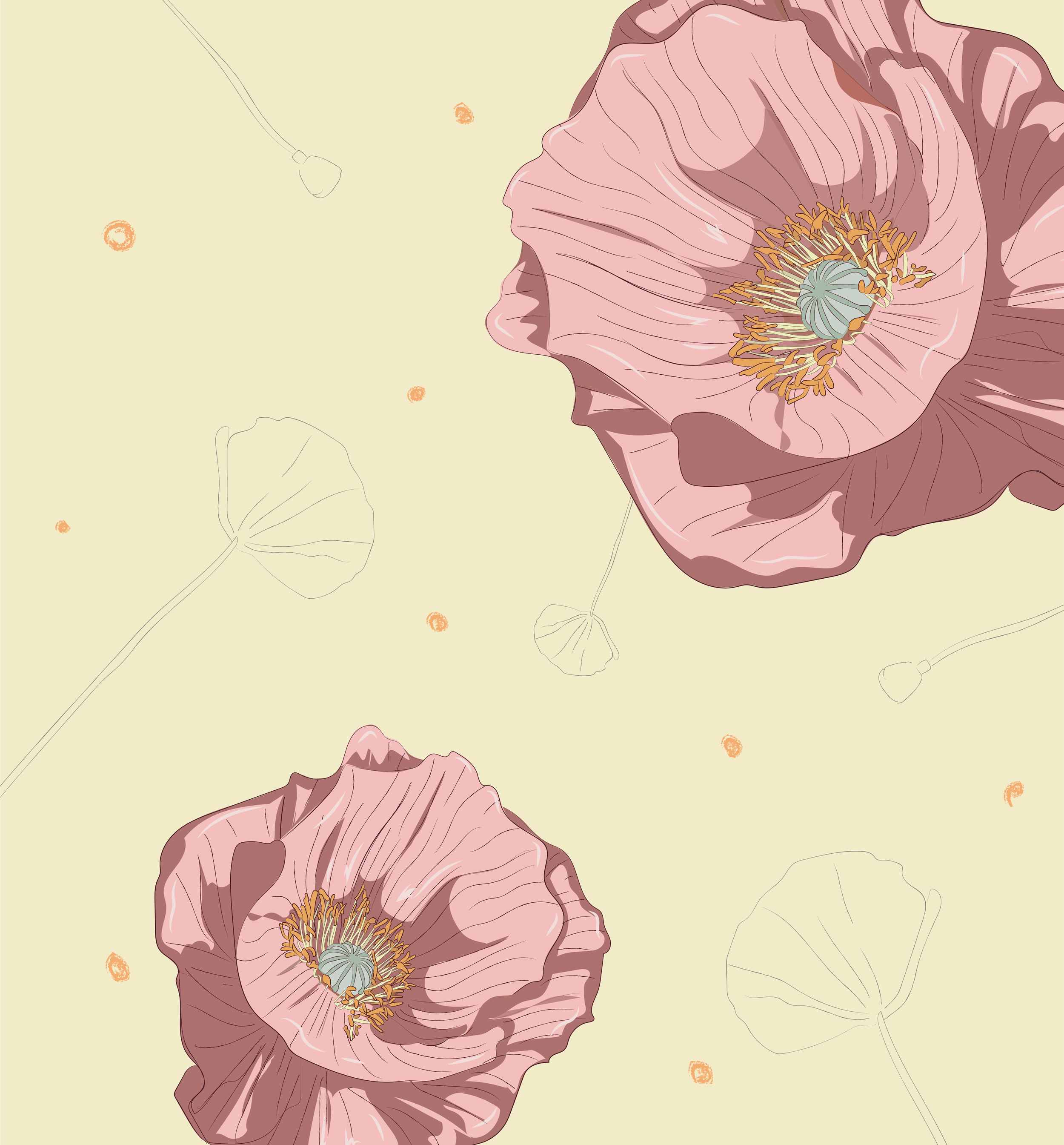
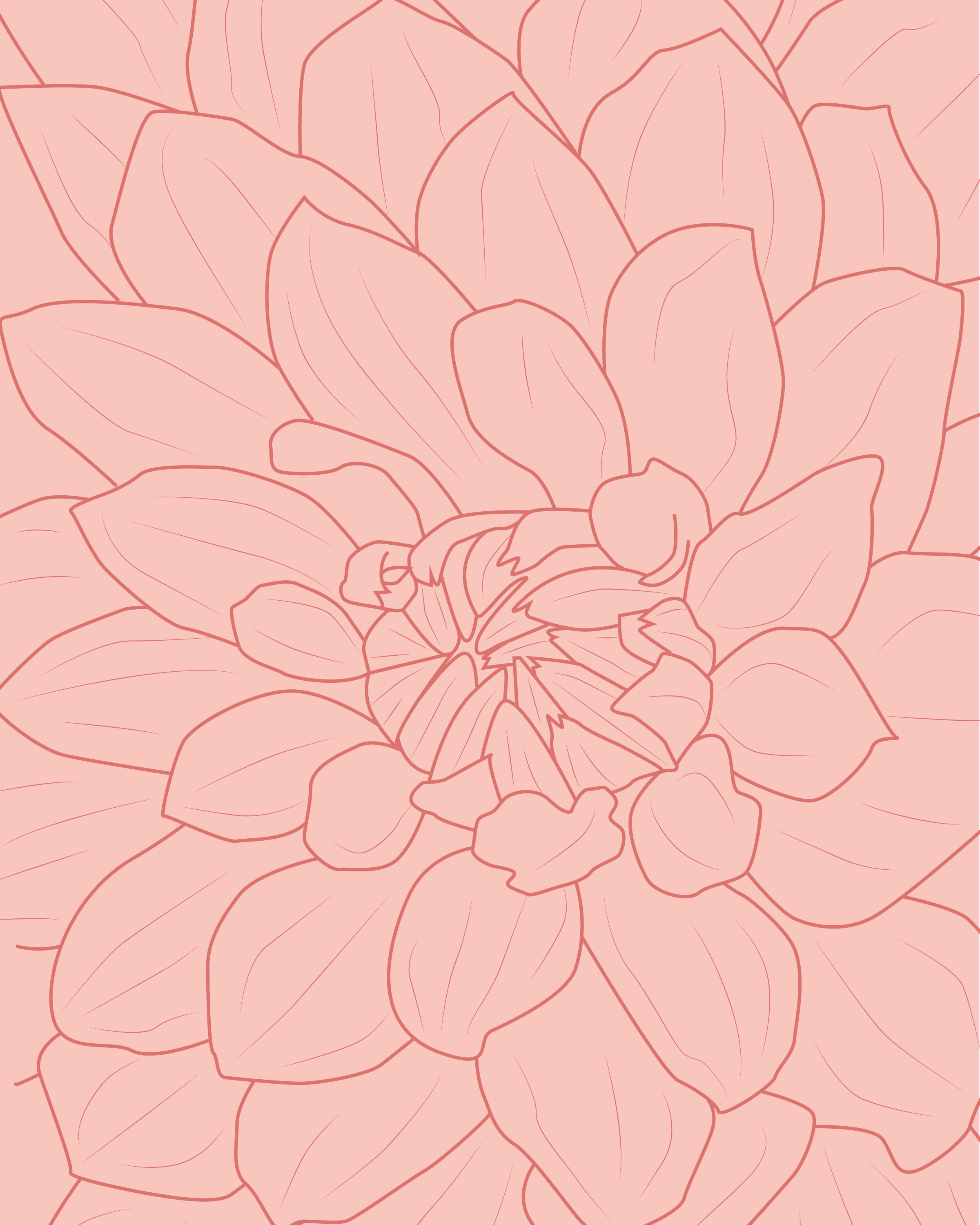
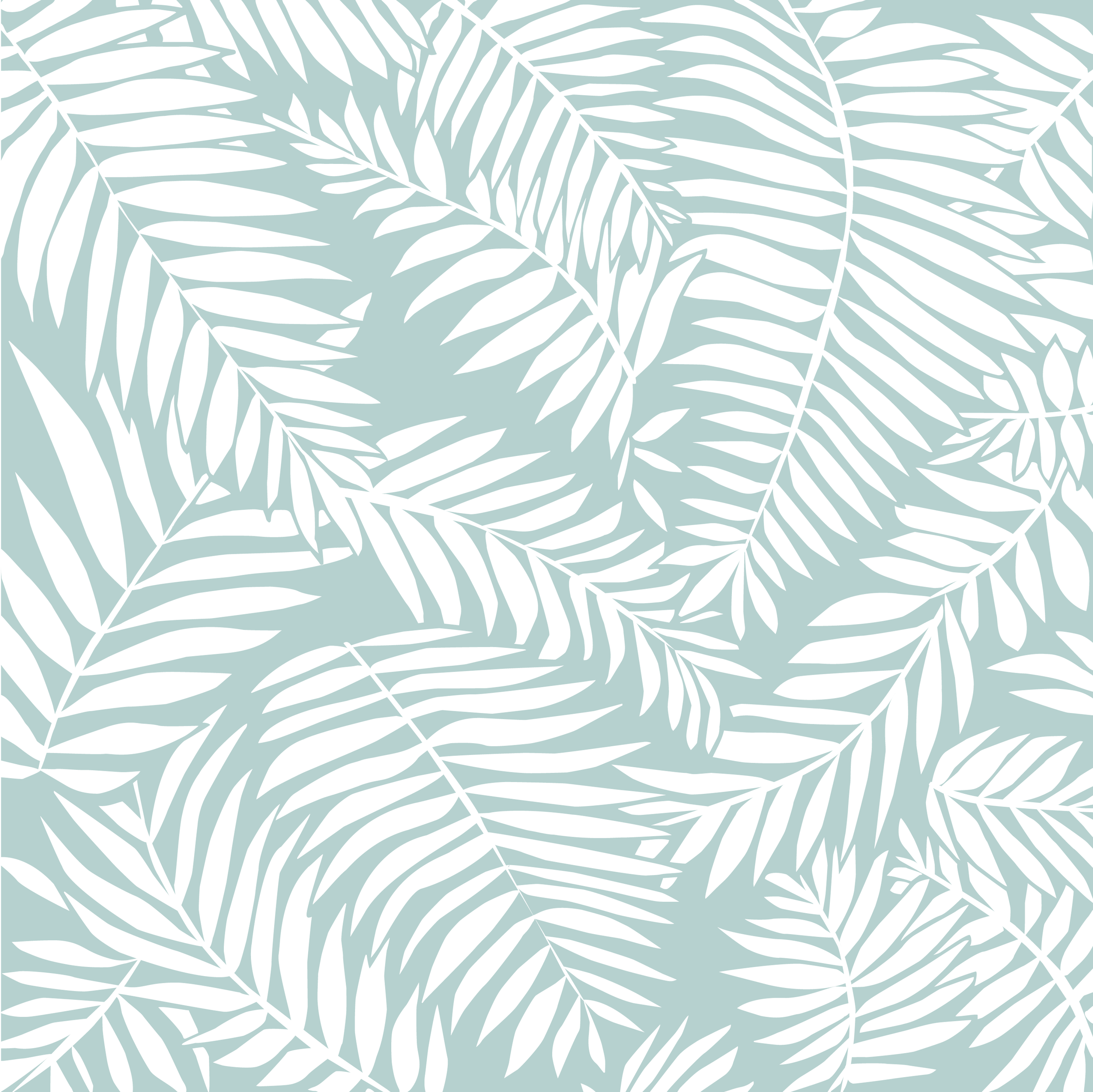
Botanicals
A series of botanical illustrations created for home textiles and art prints. All work done in Adobe Illustrators.